ButtRoll
A packaging request that grew into a full brand identity and a website — after asking the client a question he hadn't been asked yet: what about branding?
The short version
The client came to me in July needing packaging design for his tissue paper brand. While brainstorming the packaging, I realised he had no brand identity to build it on — something that would only matter more as the business grew. He approved building one first. Once the identity was locked, the packaging followed, and by the end I'd also built the business a website to give it a digital presence.
A packaging brief, at first
ButtRoll came in as a single, specific ask: design the packaging for a tissue paper product. There was no logo, no colour system, no existing brand materials — the request was scoped around one deliverable, not a full identity.
A gap the client hadn't flagged
Packaging designed with no brand behind it tends to age badly — it works for one SKU, then falls apart the moment the business needs a website, social presence, or a second product. That gap wasn't part of the original brief, but it was going to matter, and soon.
What the work had to do
Flag the missing brand identity early and make the case for solving it first, not after packaging shipped.
Create an identity flexible enough to extend across packaging, signage and future materials.
Once the identity existed, build a website that could actually tell people what ButtRoll is.
What I actually did
I worked as Brand Identity, Packaging and Web Designer — the project grew in three stages as each one surfaced the next: brand identity first, then packaging built on top of it, then a website once the business needed a digital presence.
How it came together
The starting brief only covered packaging, but there was no mark to put on it — just an idea for a name. I vectorised the logo into a proper, reproducible iconmark and wordmark before touching layout, working through it in grayscale first to get the form right independent of colour.
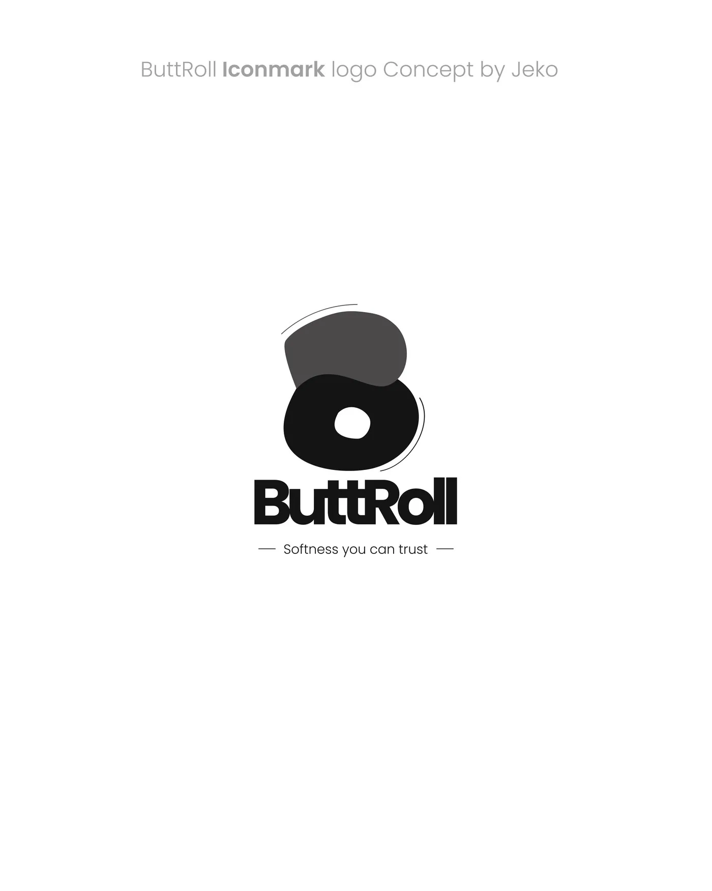
Logo development — grayscale, before colour
With the identity approved, packaging came next — designed as a template rather than a one-off label, so the same structure (product info, compliance icons, barcode, QR code) could carry future variants without starting over. Once packaging was done, I raised a second gap: the business had a product and an identity, but nowhere online to point people to. With the client's go-ahead, I built the website last, carrying the same identity through.
Why it looks the way it does
Teal instead of the expected blue
Hygiene products default to cool blues and whites almost automatically. A warmer teal, paired with an unexpected rust-brown accent, gives ButtRoll a distinct shelf presence without losing the "clean" signal the category needs.
A mark that looks like the product
The overlapping rounded forms in the icon echo a rolled sheet of tissue itself — the logo doesn't just label the product, it visually rhymes with it.
Identity, packaging and the site
One identity, carried from the roll itself through to the website.
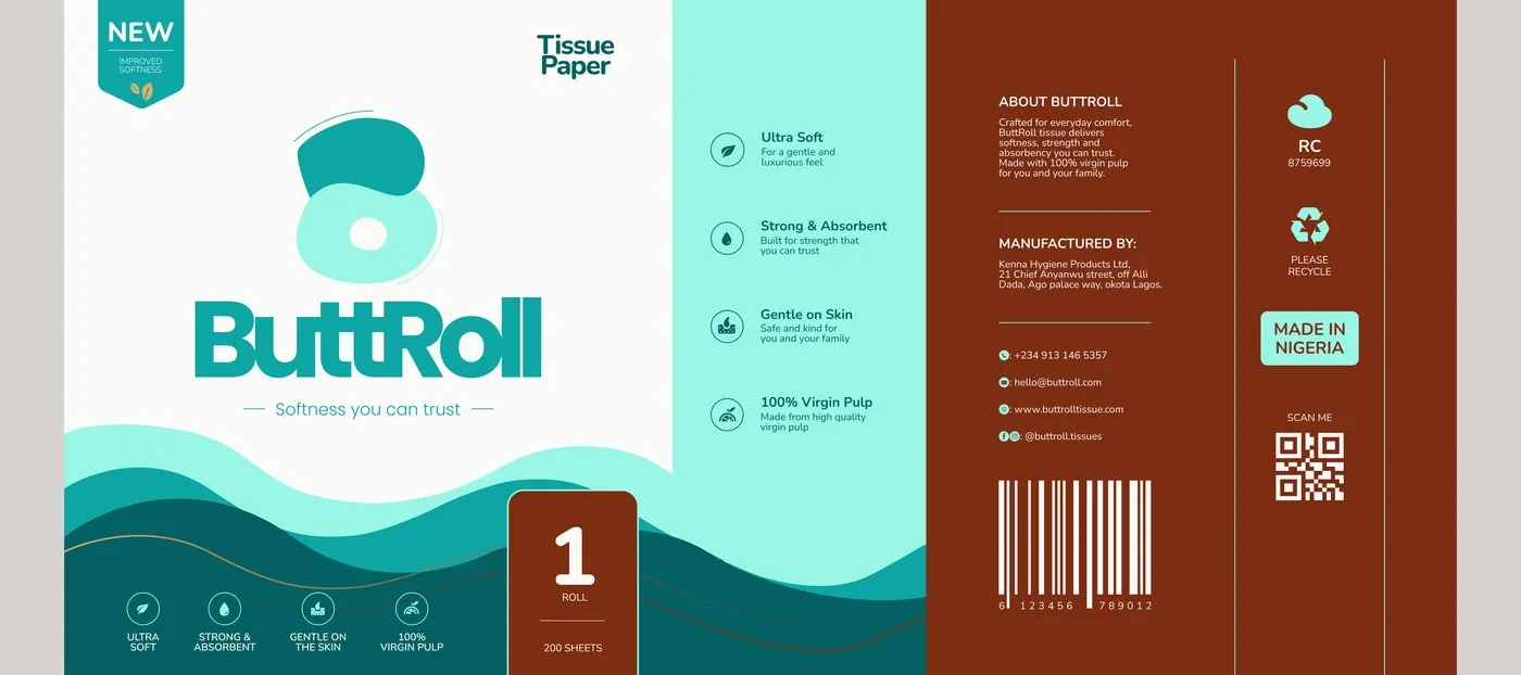
Packaging — flat label design
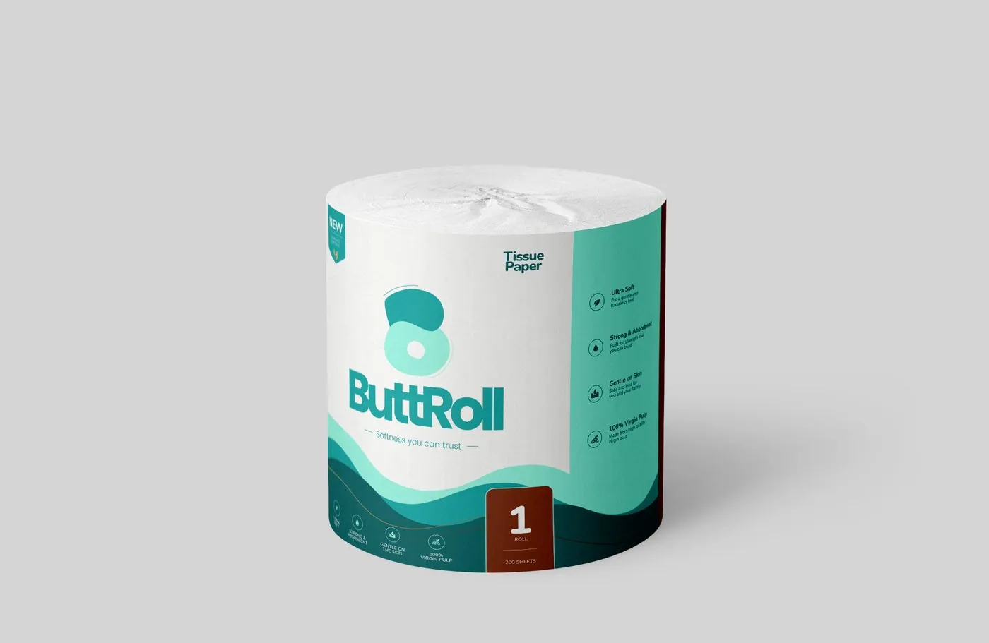
Packaging mockup — front
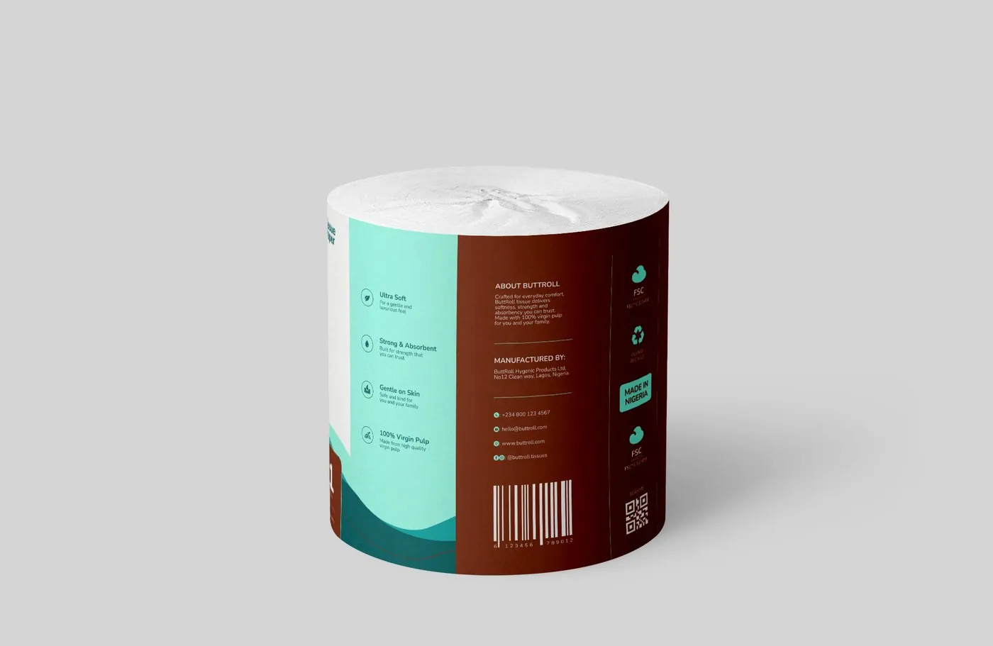
Packaging mockup — back
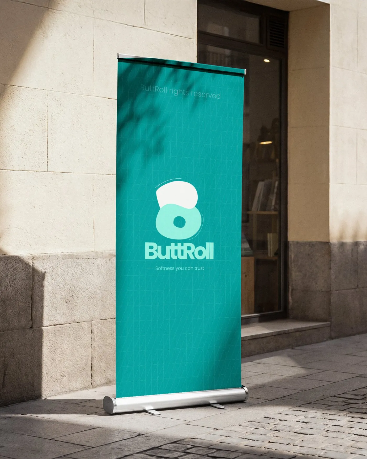
Signage — rollup banner
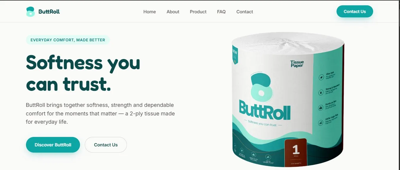
Website — homepage
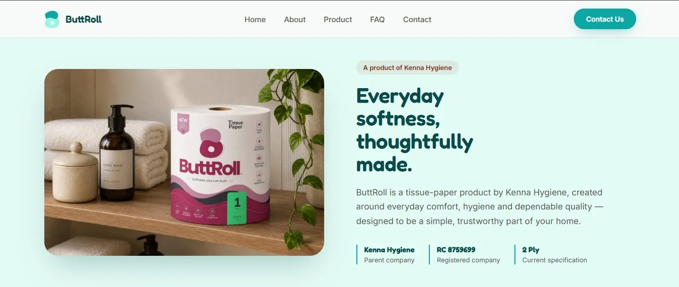
Website — about
Where this stands
ButtRoll now has a complete identity, shipped packaging, and a live website — three deliverables that didn't exist when the project started with a single packaging request. You can see the site for yourself at the link below.
What this project taught me
This one taught me the value of naming a problem the client hasn't asked about yet — twice over. Neither the brand identity nor the website was in the original brief; both came from noticing a gap and making the case for it before it became urgent. That's a different skill from executing a brief well, and it's the reason this ended up as three deliverables instead of one.