Lazy Yute
A logo that started as a scrambled wordmark and became a clean lettermark once the client called out what he actually wanted: something that read as luxury, not just streetwear.
The short version
The owner came to me in July wanting to start a streetwear brand, needing a logo and a set of shirt designs. The first logo direction was a scrambled, graffiti-style wordmark — it worked, but the client wanted something that read as luxury rather than pure streetwear, so I moved to a cleaner lettermark instead. Once that was approved, we built out five t-shirt designs for print, wrapping up in November.
A new brand, a clear brief
Lazy Yute was starting from nothing — a name and a streetwear concept. The brief was direct: a logo, then a set of shirt designs to print and sell.
Streetwear, but not only streetwear
The first wordmark — scrambled, hand-built lettering — read as authentically streetwear, but the client wanted the brand to feel like a luxury label too. Those two impressions don't usually come from the same kind of mark, so the logo needed to change direction, not just get polished.
What the design had to do
Move from expressive, scrambled lettering to something clean enough to feel premium.
Stay wearable and current — a luxury feel shouldn't mean losing the brand's core audience.
Carry the approved identity across five distinct, print-ready t-shirt designs.
What I actually did
I worked as Brand Identity Designer, taking the logo through two full directions before landing on the approved mark, then designing five t-shirt graphics built around it.
How it came together
The first concept was a scrambled, hand-built "Lazy Yute" wordmark — tilted, overlapping letterforms with real streetwear energy. It was tested on an actual shirt mockup to see how it wore.
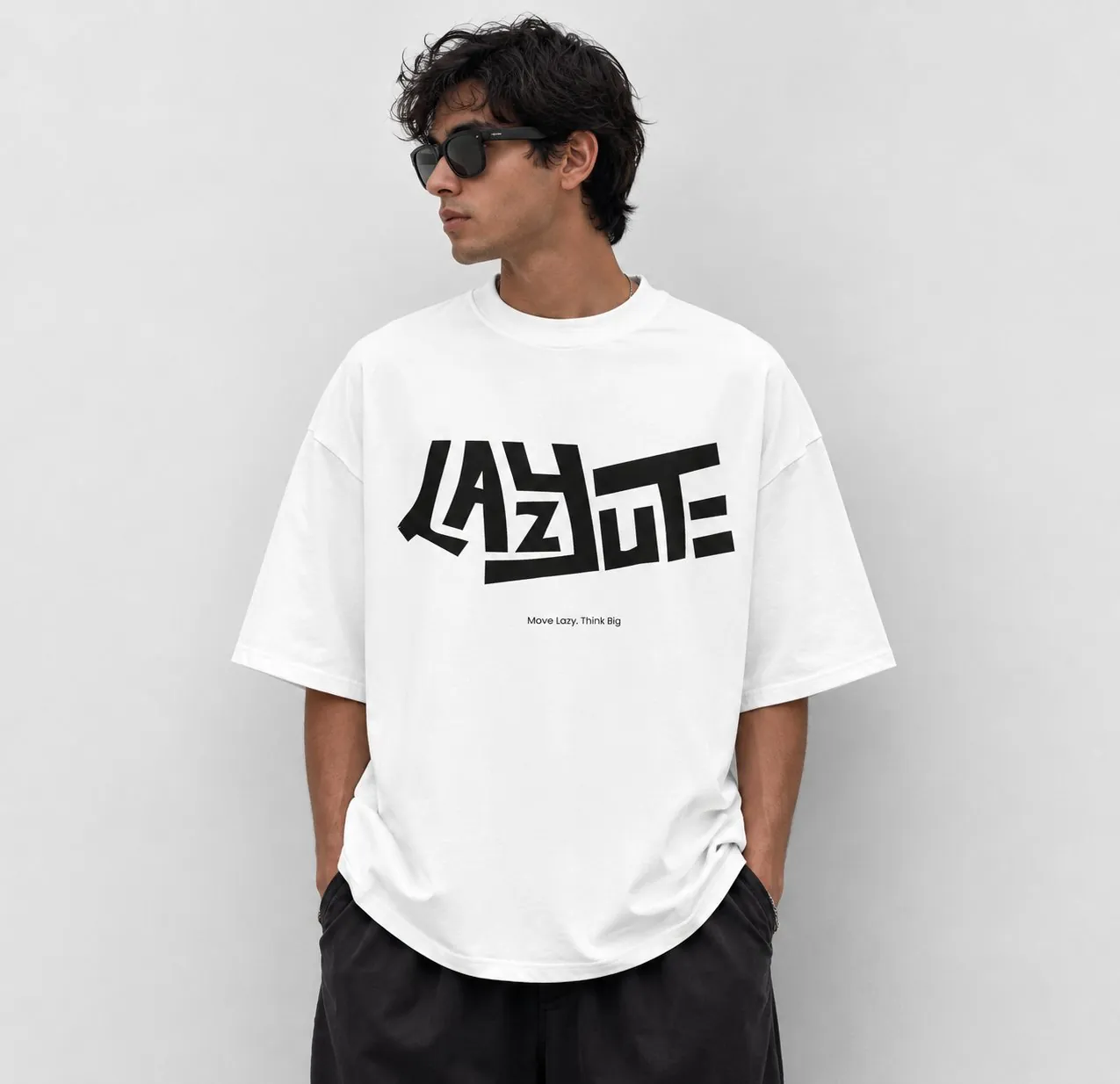
First concept — scrambled wordmark, tested on a shirt
It worked, but wasn't the full brief — the client wanted the brand to feel like a luxury label, and expressive lettering wasn't going to get there on its own. So I sketched and vectorised a new direction: a clean "LY" lettermark, built from simple geometric strokes rather than expressive type. Once that was approved, it became the foundation for five t-shirt designs, each built around the same mark rather than treated as unrelated graphics.
Why it looks the way it does
Geometry over expression
Where the first wordmark drew attention through irregular, tilted letterforms, the final "LY" mark is built from clean, rectilinear strokes — the kind of restraint that reads as considered rather than loud, which is what "luxury" meant here.
Black, white and red — used sparingly
A tight three-colour system keeps every shirt design recognisably part of one brand, whether the graphic is a bold back-print or a small chest logo.
The mark and the collection
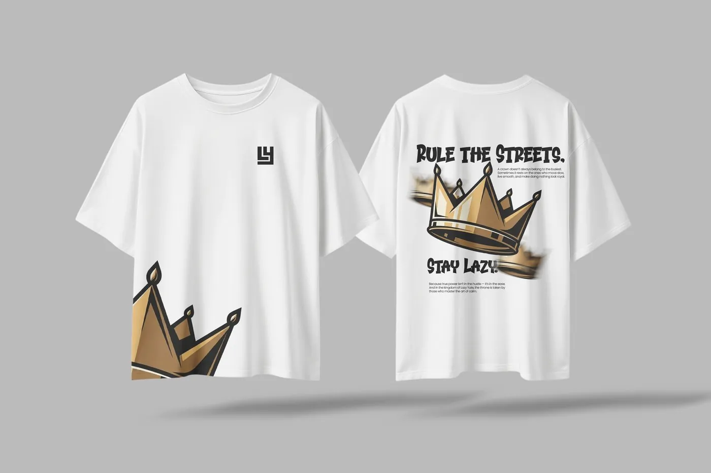
The approved identity, then three of the five shirt designs built on it.
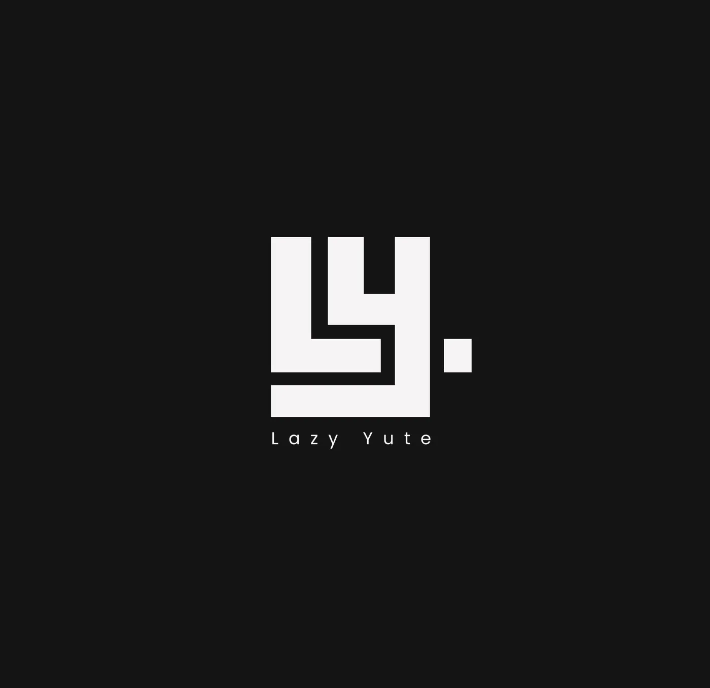
Final identity — LY lettermark
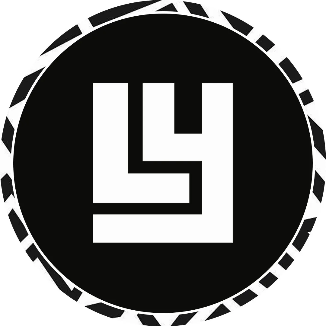
Iconmark — sticker application
Crown Unisex Edition
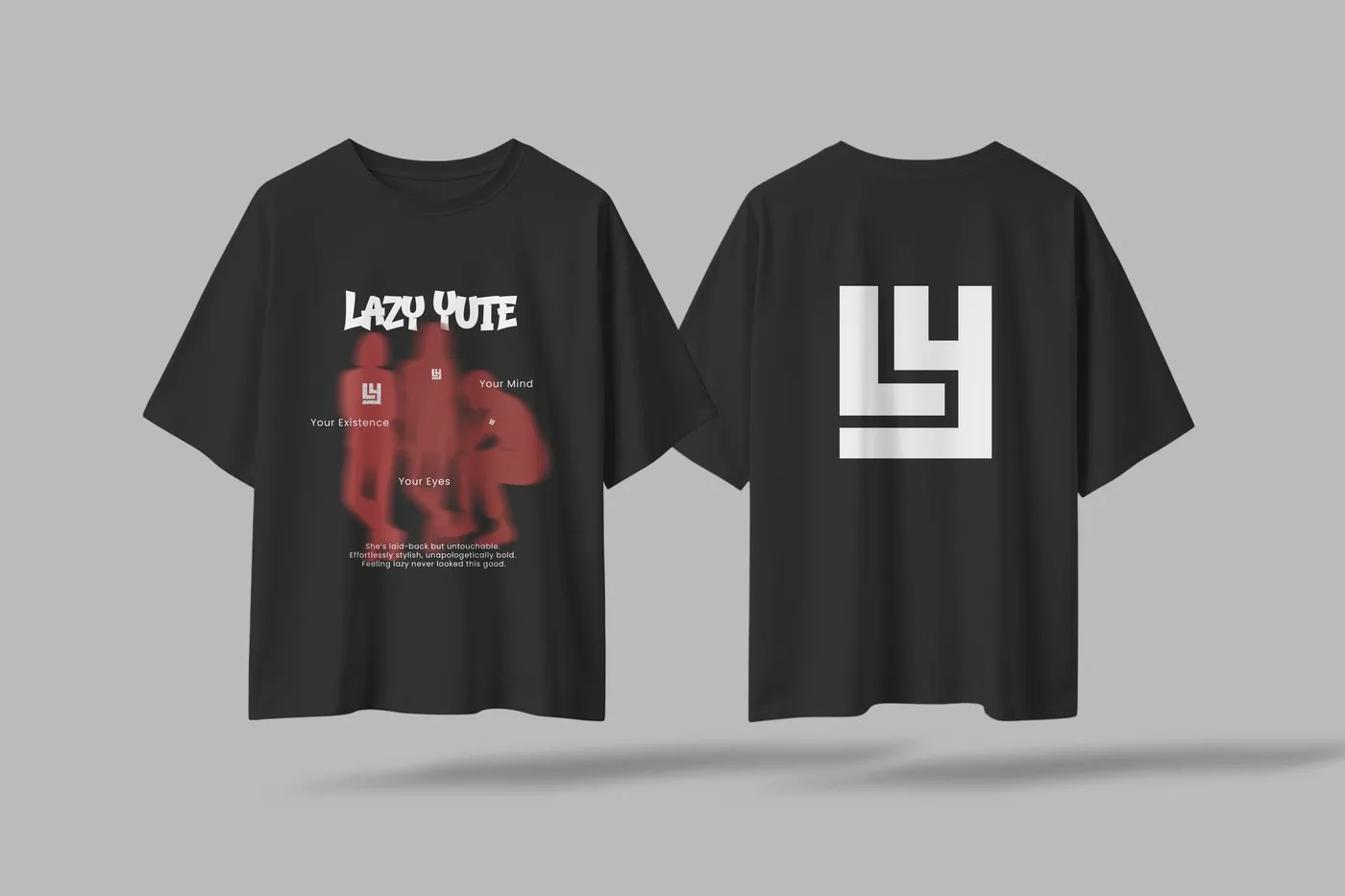
Female Edition
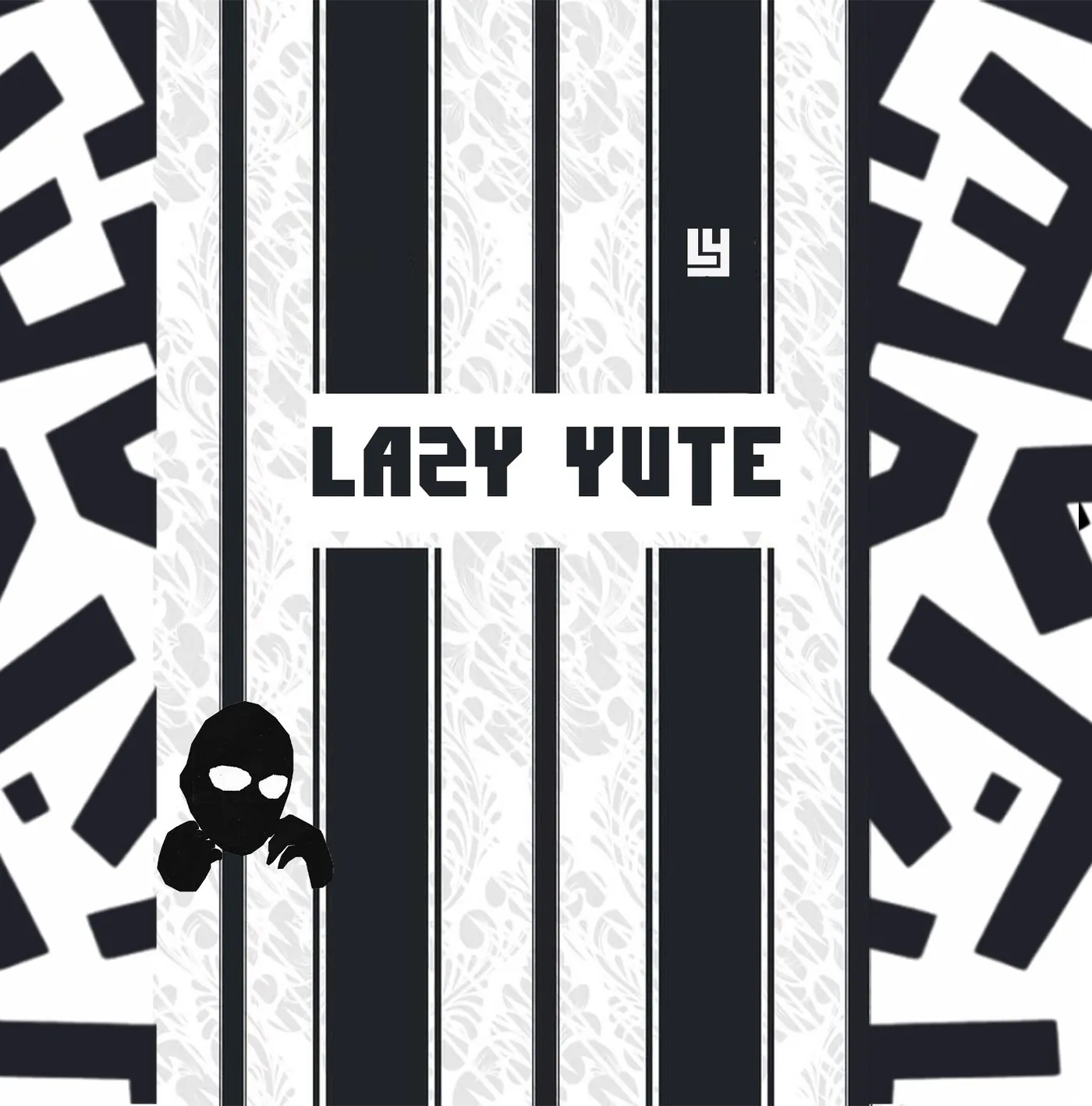
Jersey Edition — front
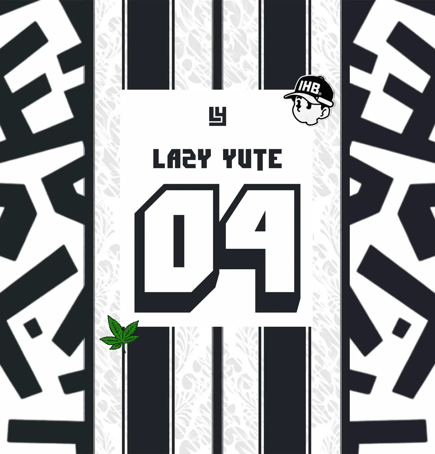
Jersey Edition — back
Where this stands
Lazy Yute launched with a finished identity system — a wordmark, an "LY" lettermark and icon, and a five-design print collection built consistently around it, delivered across the four months of the engagement.
What this project taught me
The first wordmark wasn't wrong — it was well executed and full of character. It just wasn't the brief once the client said what "luxury" meant to him. Being willing to set aside a concept that worked, rather than defend it, was the actual job here: the second direction only happened because the first one got a real answer instead of a polite one.
NEXT PROJECT