SBT Apartments
A logo concept picked over two other designers' entries, which grew into an ongoing monthly content partnership — copy and campaign design together, still running today.
The short version
I was contacted in September 2025 to pitch a brand identity for SBT Apartments, alongside two other designers — my concept was the one selected. Once they'd set up operations, they came back in December to sign an ongoing contract: ten social media designs a month, including writing the campaign copy itself, which continues today.
A pitch, then a partnership
SBT needed a brand identity and ran the brief as a competitive pitch across three designers. After mine was chosen and they'd launched, the relationship continued into something ongoing — a monthly retainer for social content once the apartments were actually taking bookings.
A short-let brand needs a reason to check back in
Short-let apartments live or die on repeat attention — people need a reason to think of SBT specifically when they're planning a weekend, a staycation, or a booking. That's not a one-time design problem; it's a monthly one, with copy and visuals both needing to carry the brand's voice consistently.
What the work had to do
Design a logo that stood out against two competing concepts, built around a name simple enough to stick.
Own campaign copy as part of the contract, so message and visual were never designed separately.
Deliver ten designs a month, covering seasonal moments and always-on booking content alike.
What I actually did
I worked as Brand and Campaign Designer across two phases: the initial identity pitch, then an ongoing monthly content contract that covers both writing and designing SBT's social campaigns.
How it came together
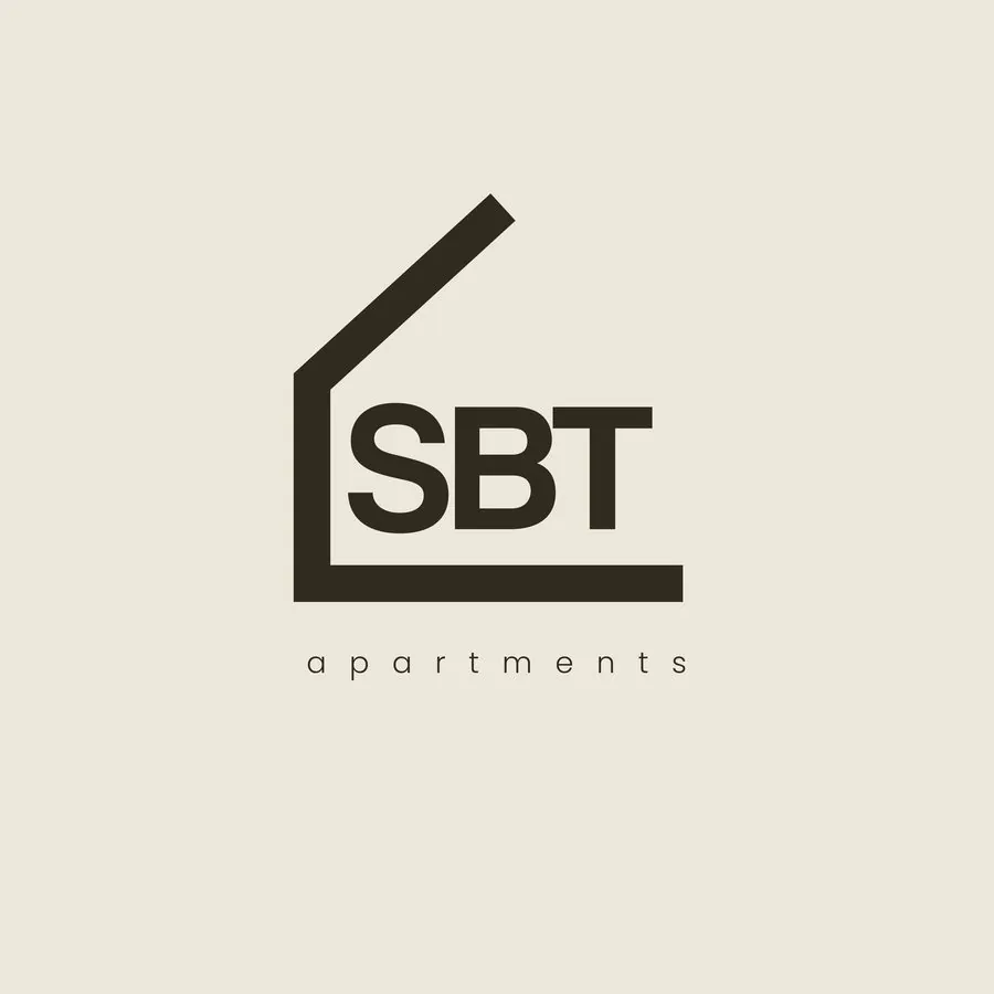
The identity started on paper — I sketched and iterated through several directions in my jotter before touching a screen. Against two other designers' concepts, I went minimal: a clear "SBT" wordmark inside a simple house-shaped line, nothing more decorative than the name needed. That's the version they chose.
Once the monthly content contract started in December, the job wasn't just design — writing the copy for each post was part of it too, done before any layout work began. Each month mixes always-on messaging (booking prompts, lux-apartment features, staycation reminders) with seasonal moments — Valentine's, Eid, Easter, a new month — all carrying the same voice and visual system.
Why it looks the way it does
A name that doesn't need decoration
"SBT" is already short and distinct — the winning concept let it speak for itself inside a single house-shaped line, rather than competing with extra ornamentation.
Warm gold against near-black
The campaign system leans on a warm gold accent against dark, editorial photography — a palette that reads as premium and lived-in rather than generic "hospitality blue."
A year of campaigns, one system
A cross-section of the monthly output — seasonal moments and always-on booking content, shown at their original proportions.
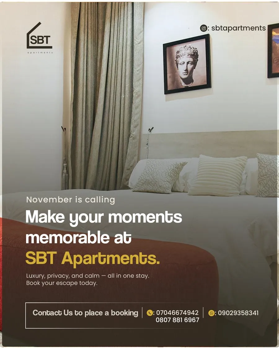
November — Make Your Moments Memorable
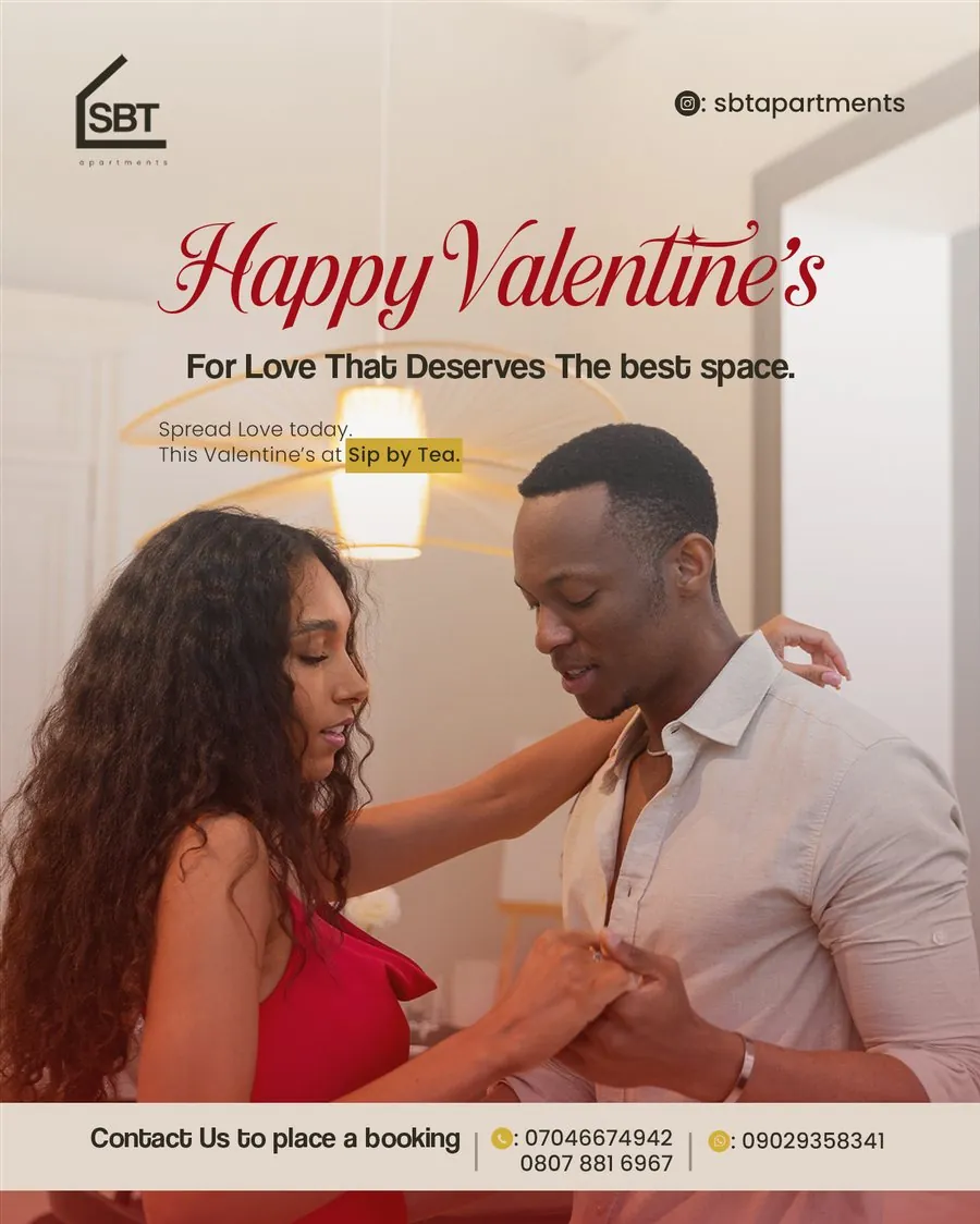
February — Happy Valentine's
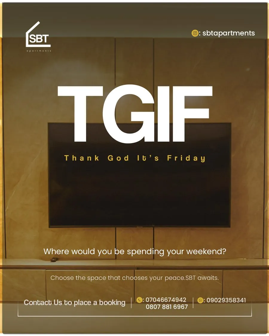
February — TGIF
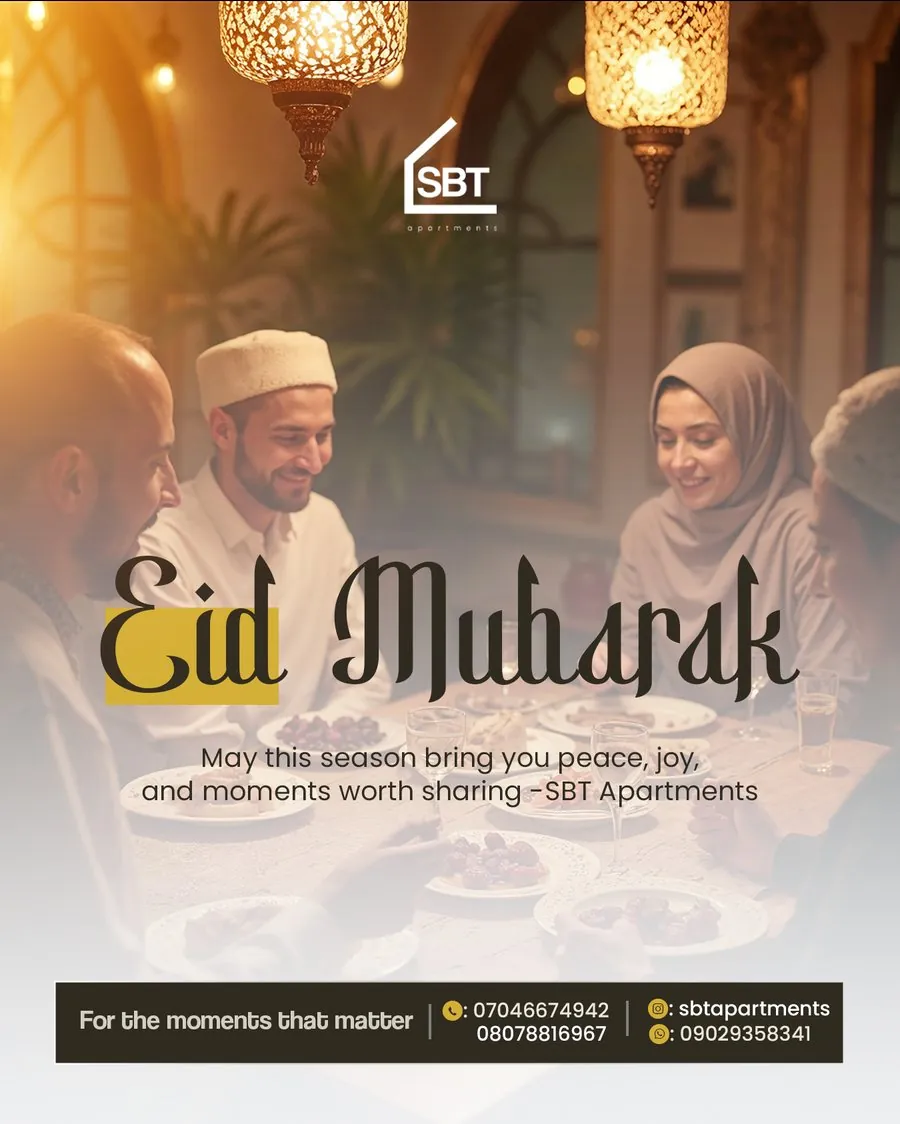
March — Eid Mubarak
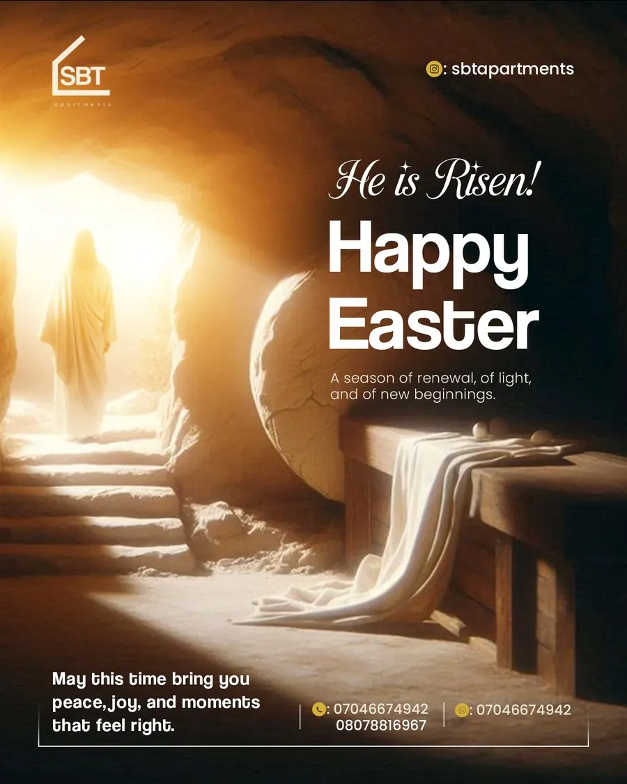
April — Happy Easter
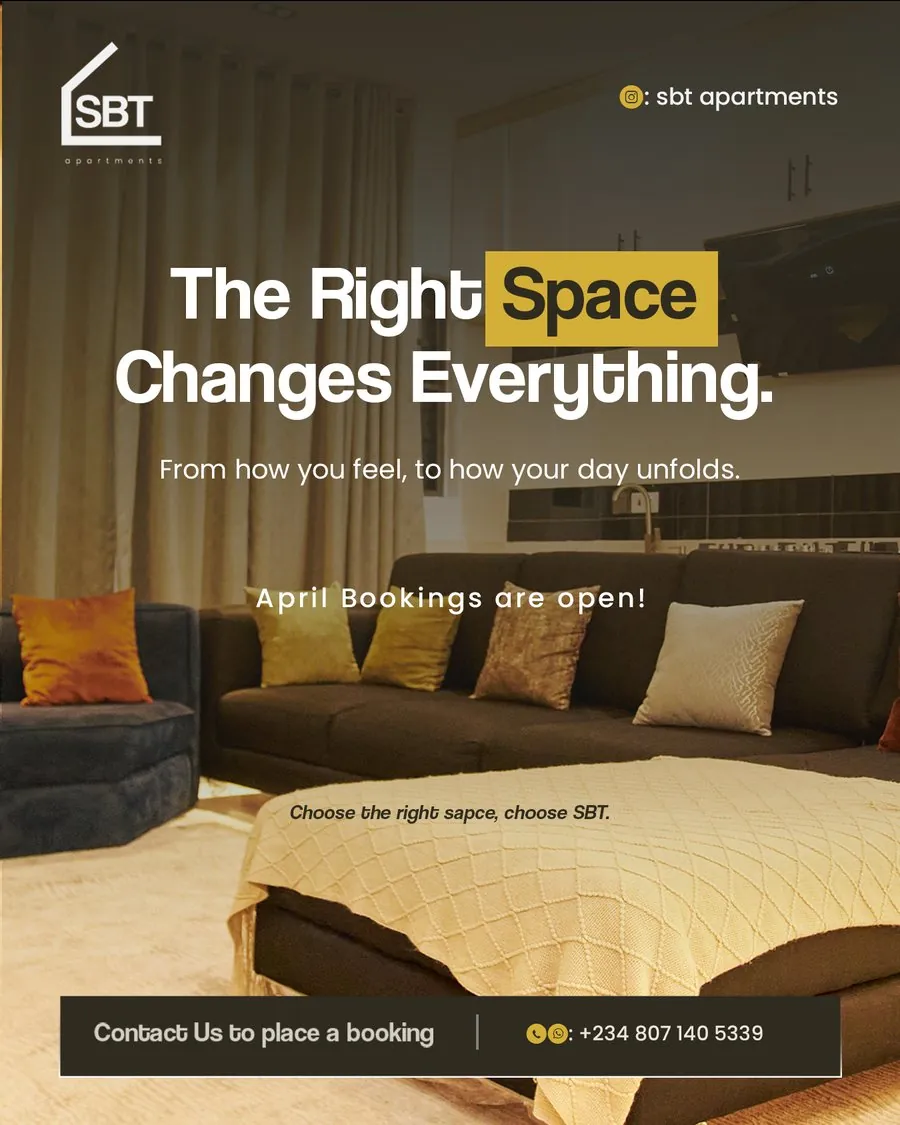
April — The Right Space Changes Everything
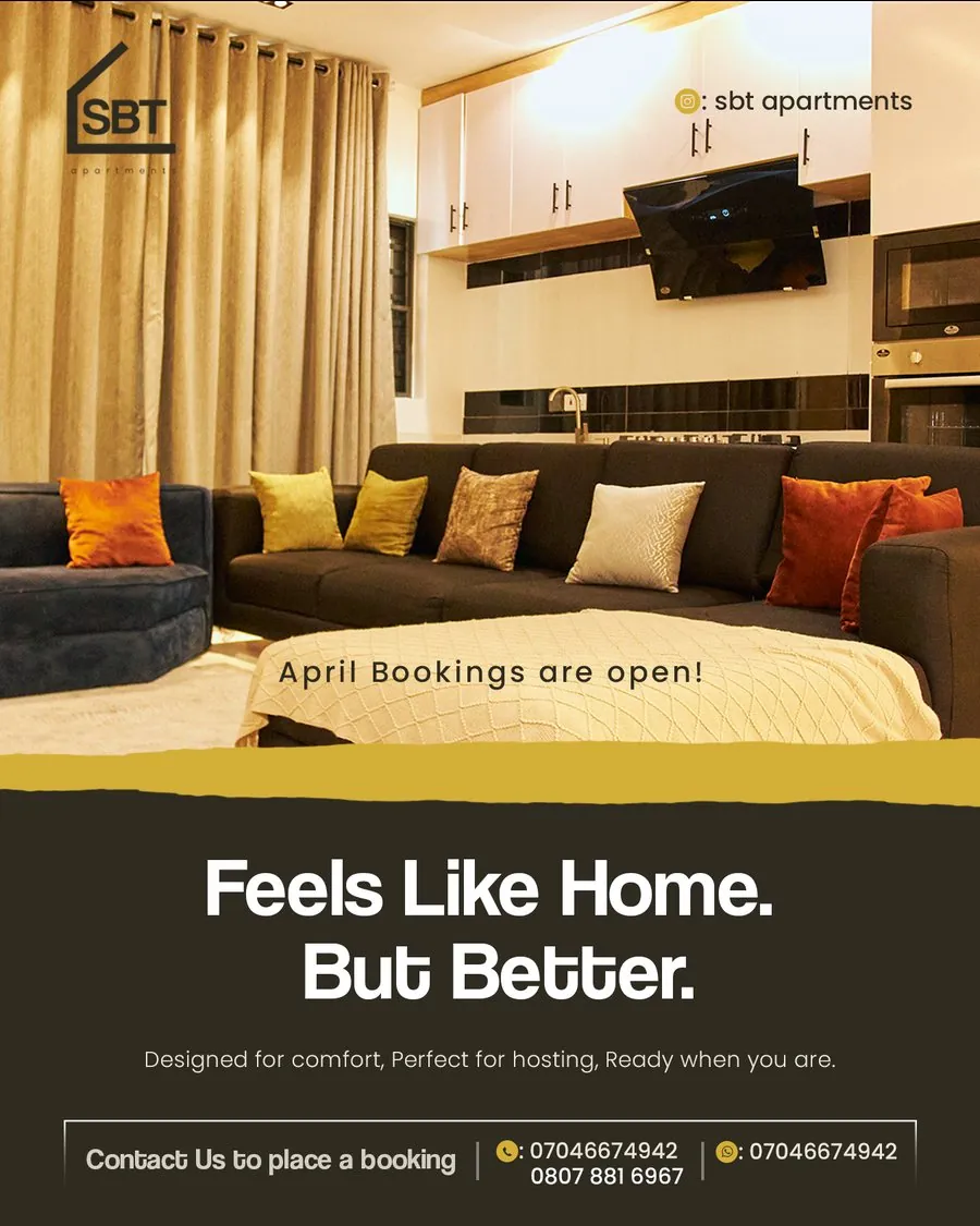
April — Feels Like Home. But Better.
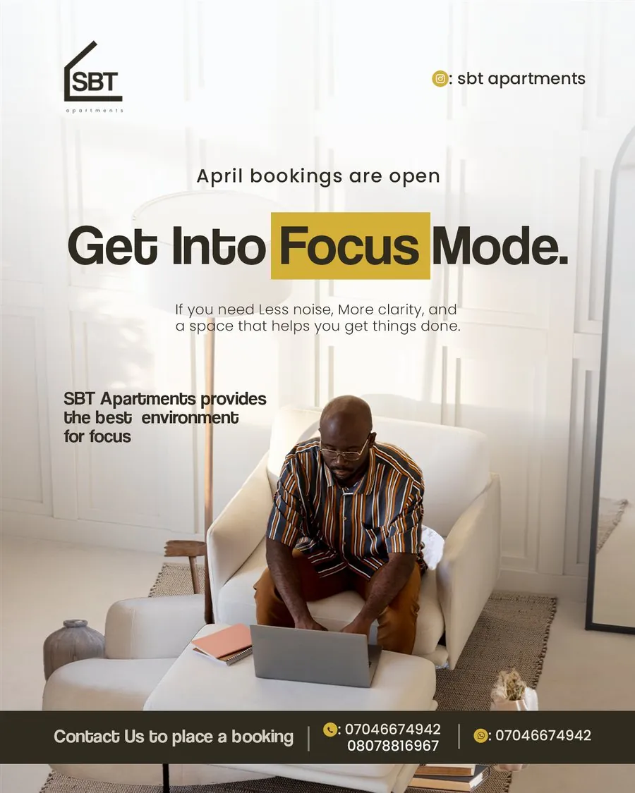
April — Get Into Focus Mode
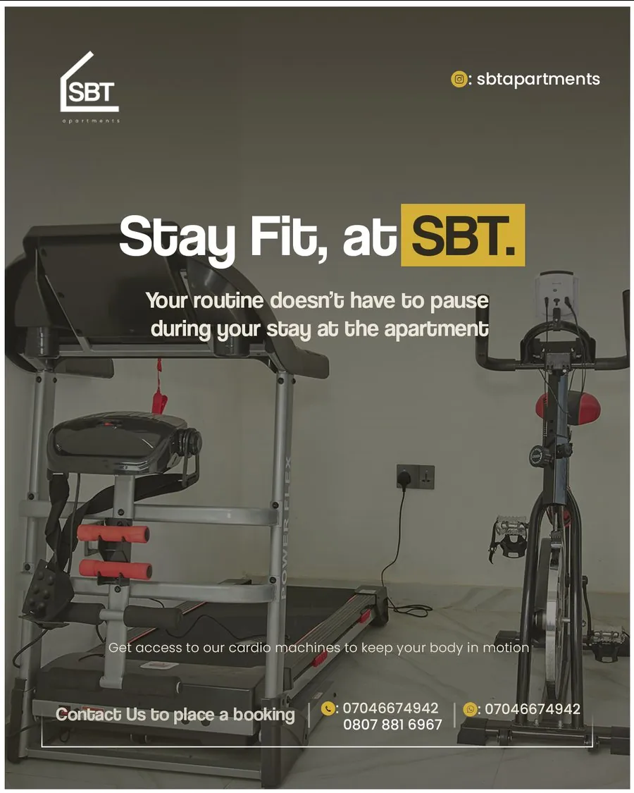
April — Stay Fit, at SBT
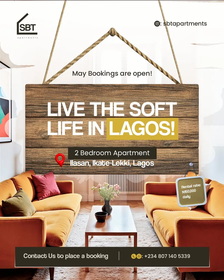
May — Live the Soft Life in Lagos
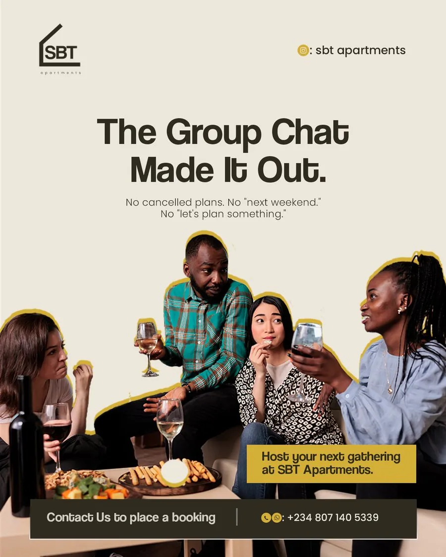
May — The Group Chat Made It Out
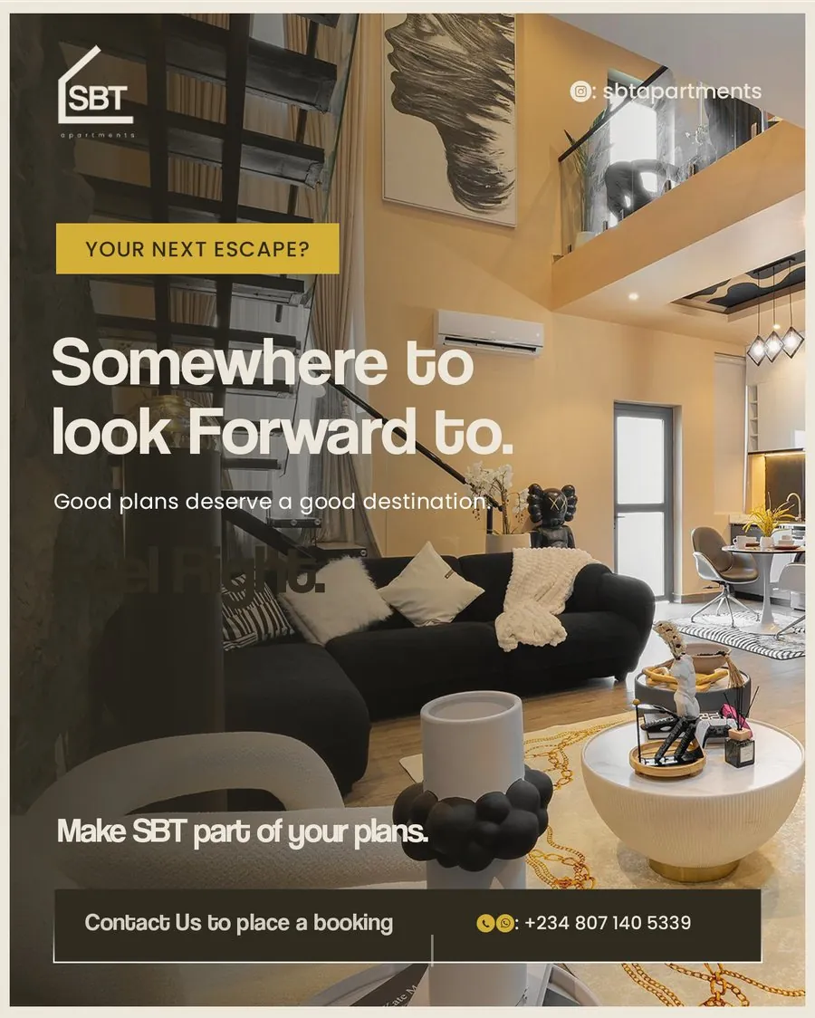
August — Somewhere to Look Forward To
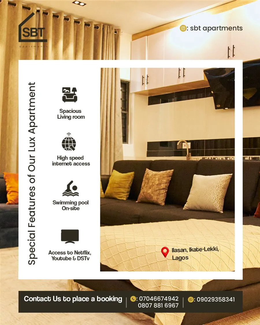
Always-on — Special Features
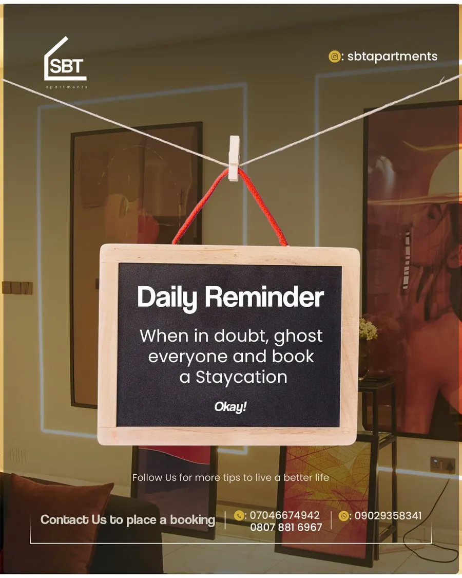
Always-on — Daily Reminder
Where this stands
The identity beat two competing concepts and became SBT's brand. What started as a single logo pitch turned into a standing monthly contract — ten designs and their copy, every month since December 2025, still running today.
What this project taught me
Winning against two other designers on the identity meant restraint paid off — the simplest, most legible concept won, not the most decorated one. And owning the copy alongside the design changed how I work on this account: writing the line first means the visual is built to support a message I already believe in, not decorating text handed to me afterward.