Olewà
A custom monogram for a contemporary African beauty house, built around the Yoruba meaning of its own name — sketched, vectorised and approved in a single round.
The short version
The client reached out about starting a contemporary African beauty brand named Olewà — Yoruba for "it's beautiful." I had a clear picture of the direction almost immediately, sketched it, then vectorised it in Figma. The client loved the first concept, and we closed the project from there.
A name that already meant something
Olewà wasn't a name chosen for how it sounded — it's the Yoruba word for beauty, chosen deliberately for a brand about to sell exactly that. The identity needed to honour where the name came from, not just sit on top of it.
Beauty through form, not cliché
Beauty brands lean hard on the same visual shortcuts — script fonts, florals, soft pastels standing in for "elegant." The brief was to celebrate beauty in a way that felt considered rather than decorative, luxury without borrowing the category's usual clichés.
What the design had to do
Root the mark in what "Olewà" actually means, not just how it's spelled.
Build elegance through form and proportion rather than default beauty-brand tropes.
Design a mark flexible enough to extend from the current offering into a fuller beauty house.
What I actually did
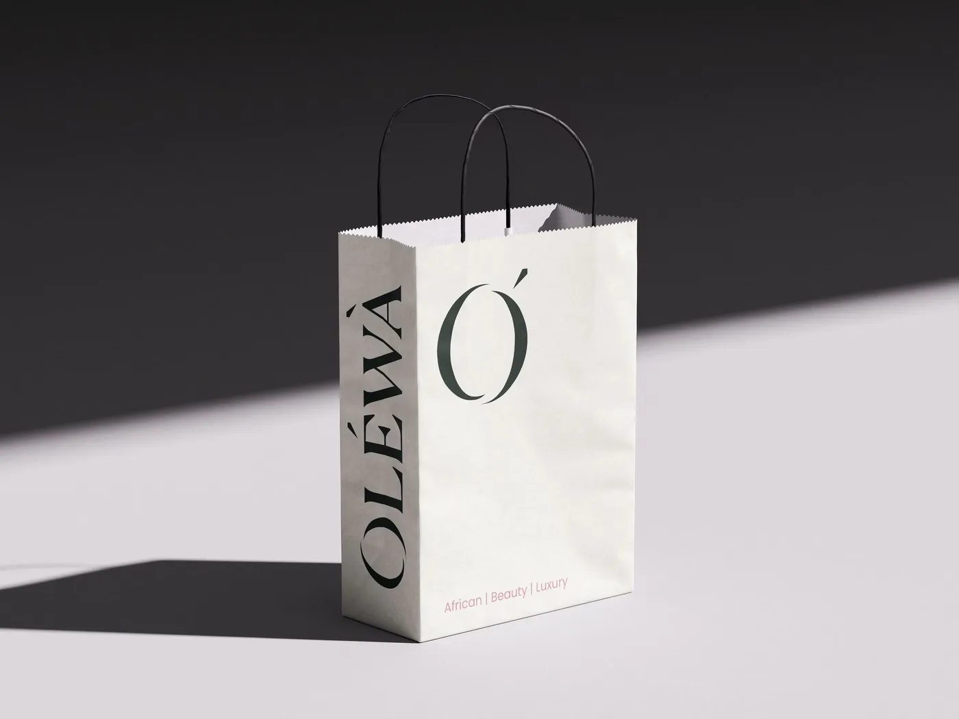
I worked as Brand Identity Designer, taking the concept from a first sketch through to a finished system — primary logo, secondary logo, standalone monogram, and an early packaging application.
How it came together
This one moved fast. As soon as the client described the vision — a contemporary African beauty house — I had a clear picture of the direction, sketched it, and vectorised it in Figma. Rather than present a handful of watered-down options, I brought one confident concept built around a custom "O" monogram: high-contrast curves that stand in for the brand's name and its meaning at once. The client responded to it immediately, and the project closed on that first direction.
Why it looks the way it does
A monogram that is the meaning
Rather than illustrating "beauty" literally, the custom "O" distills it into flowing, high-contrast curves — timeless and feminine without leaning on an expected symbol.
An accent mark rooted in the name
The diacritic above the "O" comes directly from the Yoruba spelling of Oléwà — a quiet tribute to the name's origin that doubles as the mark's most distinctive visual signature.
The mark and its system
One concept, refined into a full identity system and its first application.
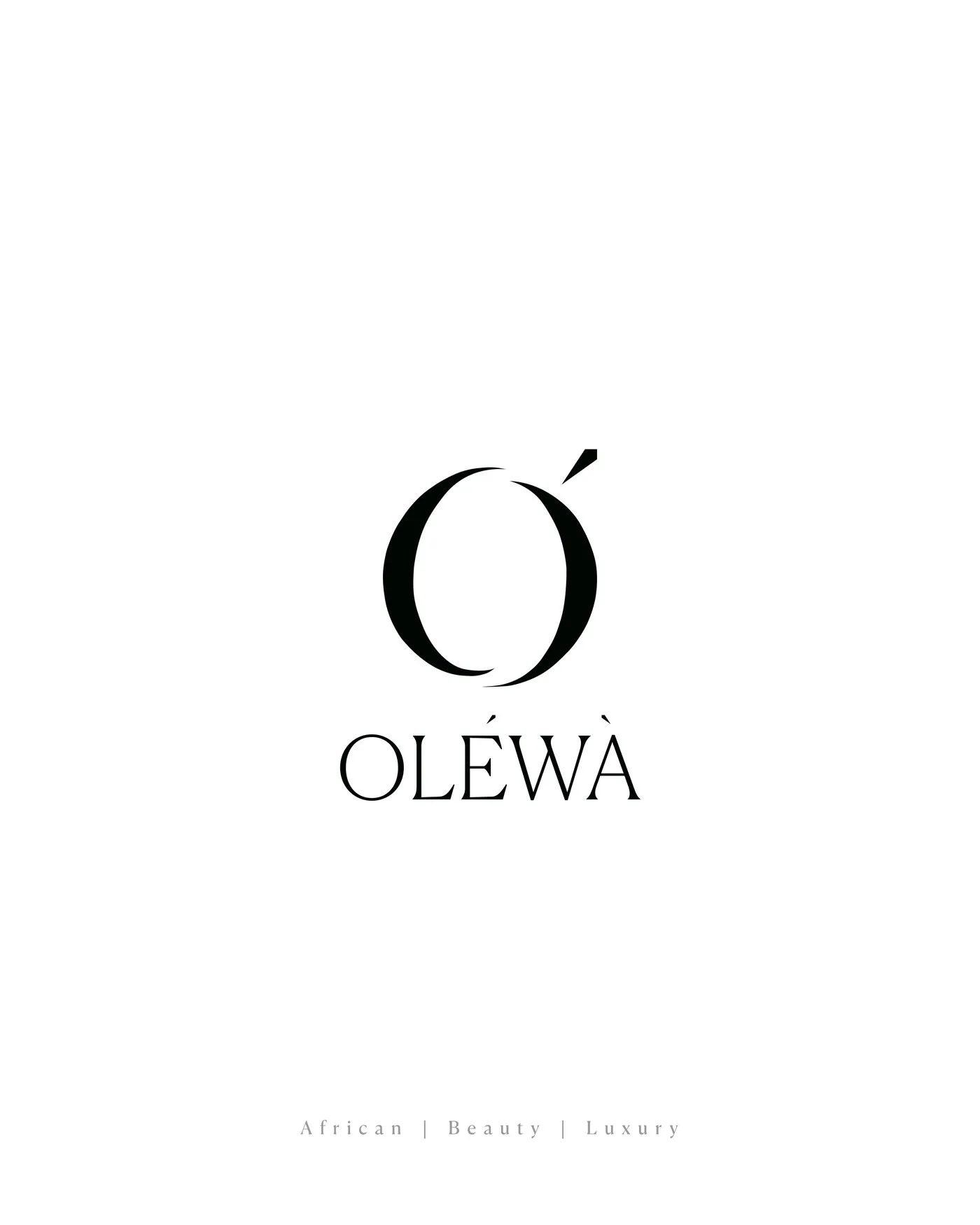
Primary logo
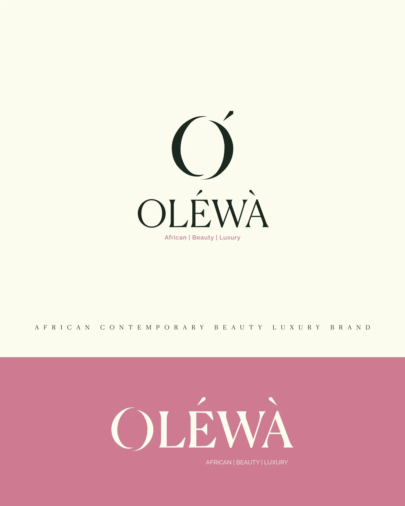
Logo on brand colourways
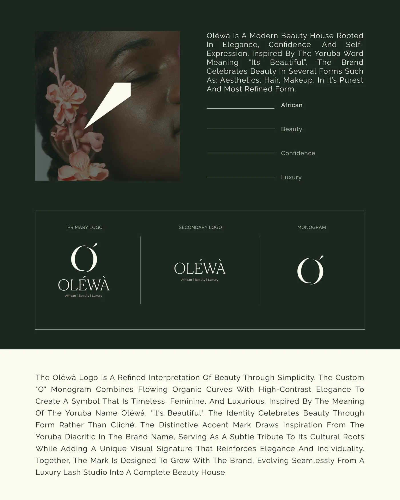
Primary, secondary & monogram system
Packaging application
Where this stands
The client approved the first concept and the project closed from there — no extended back-and-forth, no second round of directions. Olewà now has a complete mark system ready to carry it from a lash studio into a wider beauty house.
What this project taught me
Sometimes the strongest move is confidence, not options — bringing one considered direction rather than three safe ones. That only works when the concept is actually grounded in something real, in this case the name's own meaning, rather than a stylistic guess. Letting the "beauty" in Olewà shape the monogram directly, instead of decorating around it, is why the approval came fast.
NEXT PROJECT