Kacxs Energy
A deliberately futuristic identity for a solar and power-solutions brand — sketched, vectorised and colour-tested from scratch, then carried into four social designs to launch it.
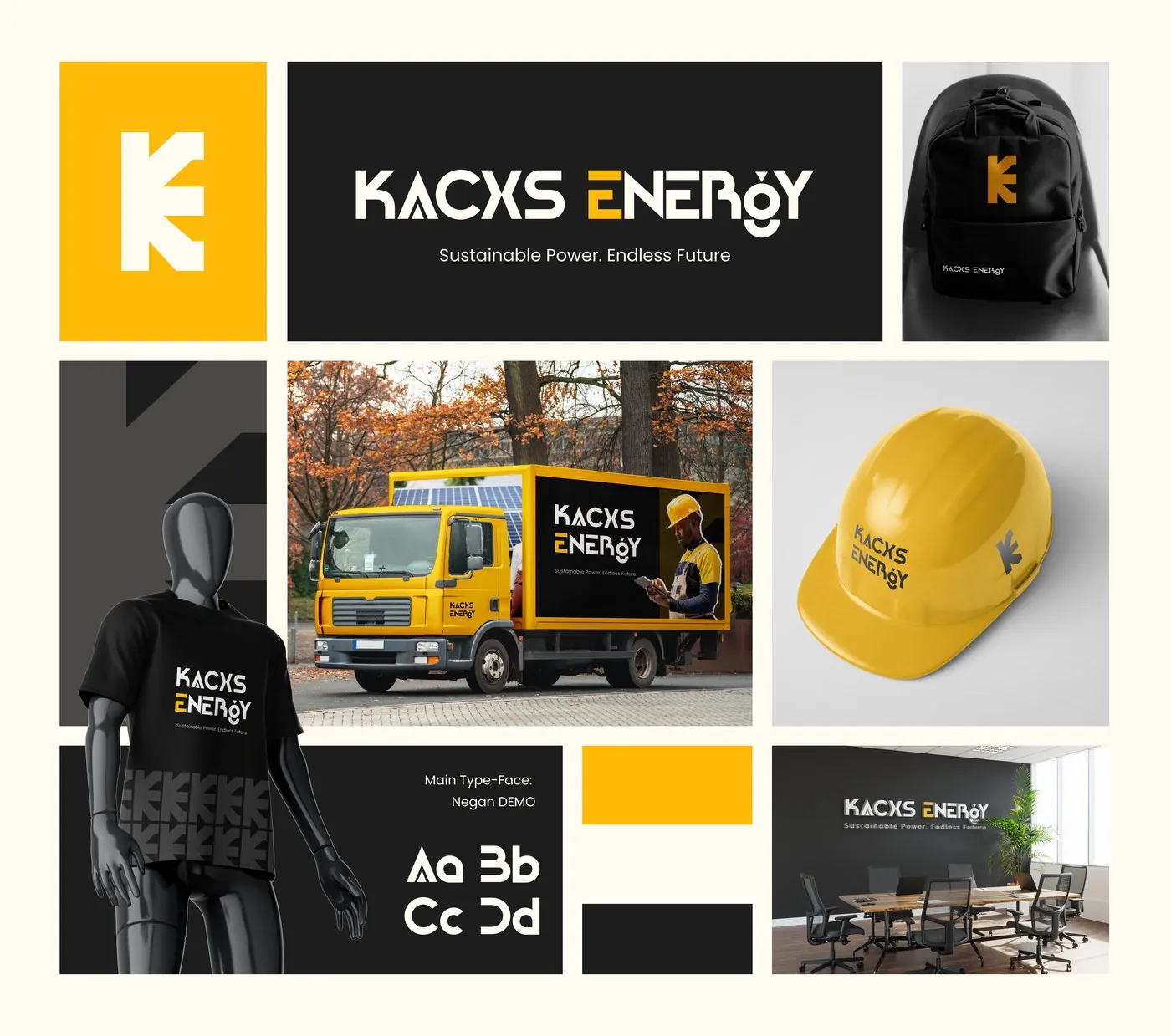
The short version
Kacxs Energy needed a full brand identity for a solar and power-solutions business, built with a deliberately futuristic point of view from the first sketch. Once the mark and colour system were locked, I carried the identity into four social media designs to kick-start the brand's public launch.
A technical product, a technical brand
Kacxs sells real hardware — inverters, lithium and tubular batteries, solar panels, charge controllers, industrial street lights. The brand needed to feel as technically credible as its product range, not like a generic "green energy" logo bolted onto a product catalogue.
Escaping the eco-brand cliché
Energy brands default to the same visual shortcuts — green, leaves, suns with rays. Kacxs needed something that read as current and forward-facing instead: a mark built on precision and motion, not eco-iconography.
What the design had to do
Base the symbol on Kacxs's own initial, not a generic industry icon.
Choose a colour and form language that broke from the category's usual green eco-visuals.
Use four initial social designs to introduce the brand and its product range, not just fill a calendar.
What I actually did
I worked as Brand and Campaign Designer, covering the logo sketch and vectorisation, the colour system, and four launch social media designs to kick-start the brand publicly.
How it came together
I put a lot of deliberately futuristic thinking into this one from the first sketch — the mark started as a geometric take on the letter "K," built from sharp, angular cuts rather than the soft curves most energy brands reach for. Vectorising it in Figma meant refining those cuts until they read as precise and directional even at small sizes, since the symbol needed to work as a standalone icon on everything from a hard hat to a truck livery.
Colour testing followed the same logic: rather than default to green, I worked through options that would carry "energy" without the cliché, landing on a high-contrast black and yellow system. With the identity locked, the four launch designs were built to each do a different job — introducing the brand, showcasing the product range, making the case for switching to solar, and building trust for buyers who can't afford downtime.
Why it looks the way it does
Angles instead of curves
The "K" mark is built entirely from sharp, angular cuts — a deliberate choice to suggest precision, direction and motion, the traits Kacxs wanted associated with reliable power delivery.
Black and yellow, not green
Skipping the energy industry's default green kept Kacxs from blending into every other solar brand — yellow carries the energy and visibility, near-black carries the technical seriousness.
The identity and the launch
From mark to system, then into the four designs that introduced Kacxs to its audience.
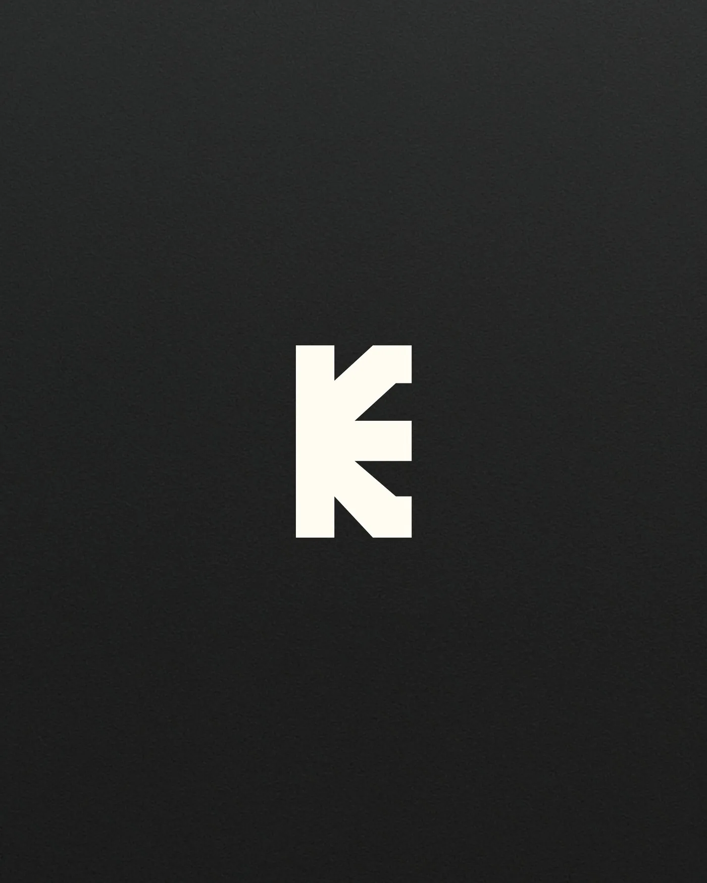
The K mark
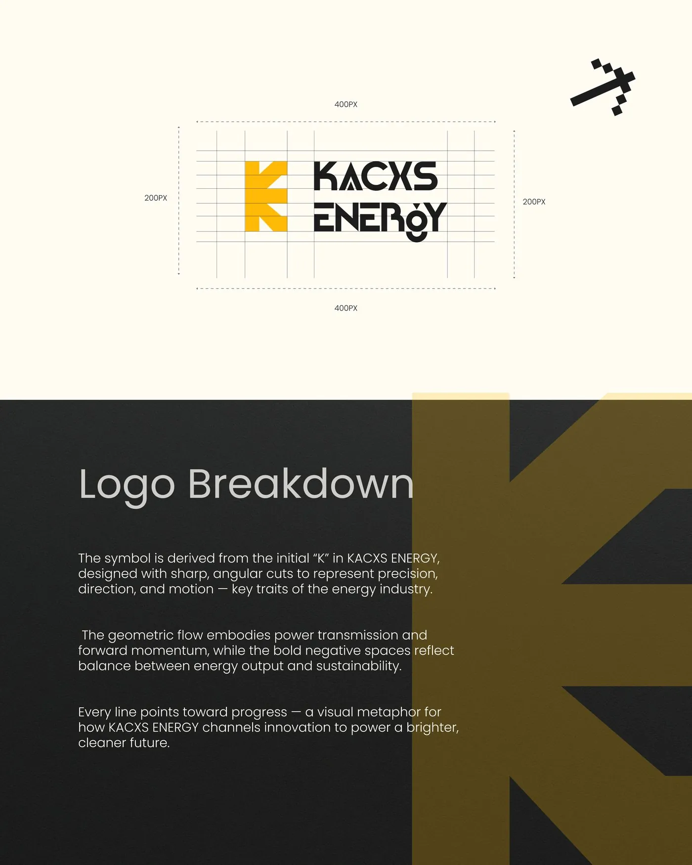
Logo breakdown & construction
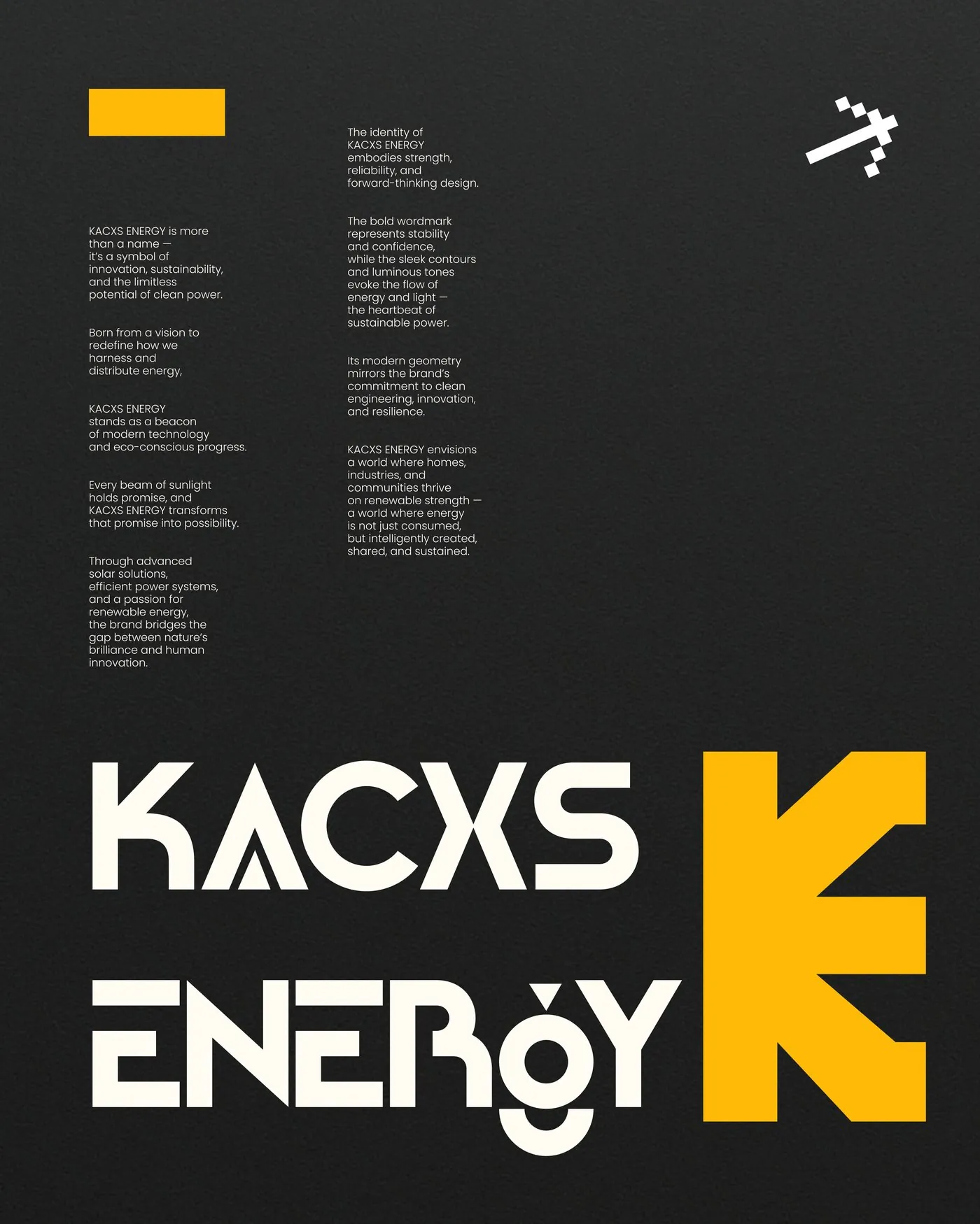
Brand story & wordmark
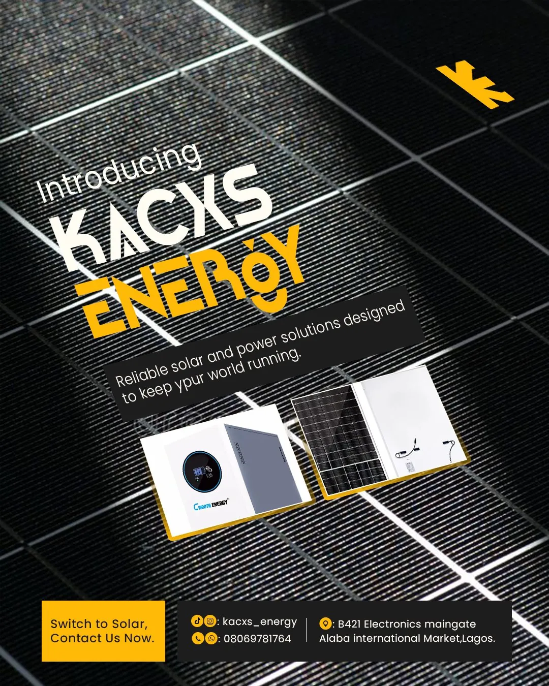
Launch — Introducing Kacxs Energy
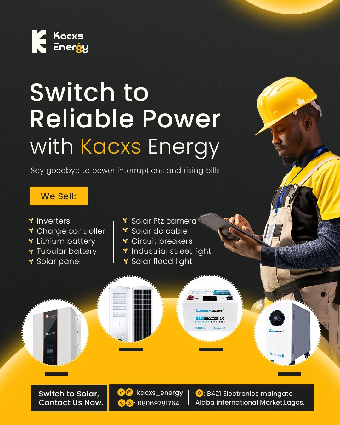
Product range — Switch to Reliable Power
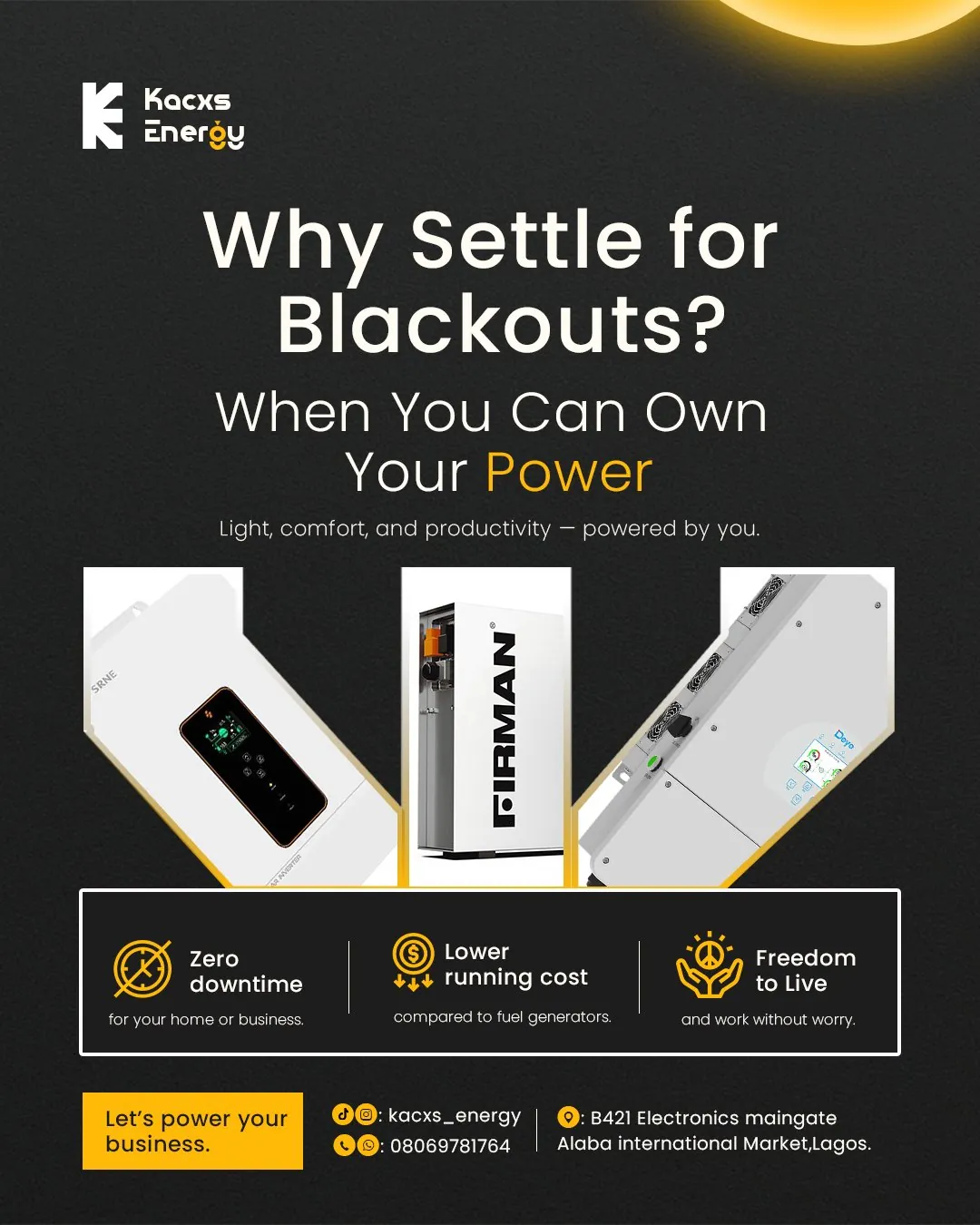
Feature — Why Settle for Blackouts?
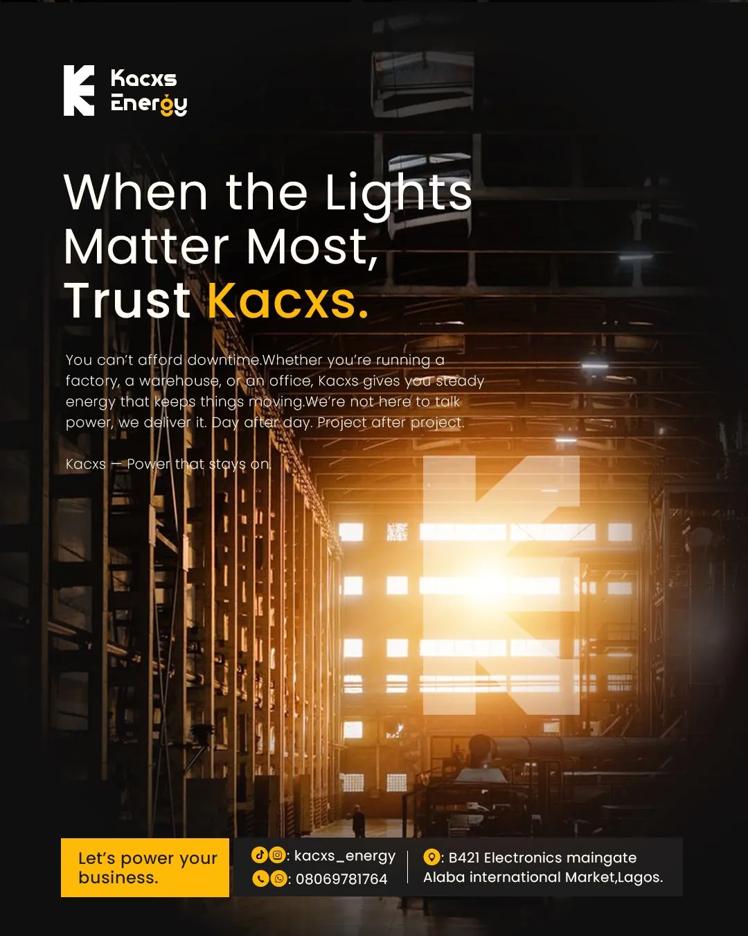
Trust — When the Lights Matter Most
Where this stands
Kacxs Energy launched with a complete identity system — logo, colour, type and real-world applications across apparel, signage and vehicles — plus four social designs built to introduce the brand and its products from day one.
What this project taught me
Designing a mark meant to carry ideas like "precision" and "motion" purely through geometry — no literal bolt, no sun icon — is a different discipline from illustrating a concept directly, and it's why the sketching phase mattered so much before any vectorising started. With only four launch designs to work with, each one had to earn its place: introduction, product range, feature benefit and trust each needed their own design rather than four versions of the same message.
NEXT PROJECT