CedarRise
A logo request grew into a full brand identity for a nonprofit's launch — built around one deliberate constraint from the client: no green.
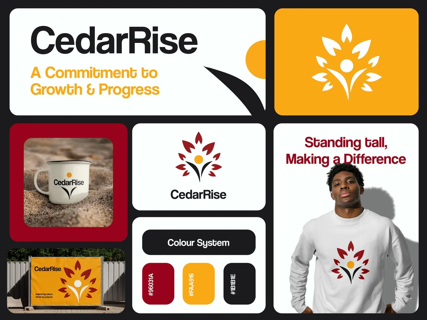
The short version
CedarRise's product manager came to me for a logo. Since the organisation was just starting out, I suggested going further and building a full brand identity alongside it — he agreed, with one clear condition: no green, since it's the default colour almost every organisation in this space reaches for.
A logo request that grew
CedarRise was a new NGO with nothing built yet — no logo, no colours, no materials. What started as a request for just a mark became the chance to set up the whole identity system a young organisation needs from day one: letterhead, colour system, and applications across merchandise and signage.
The obvious colour was off the table
Nonprofits built around growth, nature or community almost always default to green — it's the easy, expected choice. The client ruled it out specifically because it would blend CedarRise into every other organisation in its niche. The identity had to communicate growth and purpose without leaning on the one colour that usually does that job.
What the design had to do
Deliver a logo the client could launch with immediately, strong enough to extend into a full system.
Communicate growth and purpose through a palette that deliberately excluded green.
Extend the logo into letterhead, colour system and merchandise so CedarRise had something usable from launch.
What I actually did
I worked as Brand Identity Designer, taking the project from a single logo request to a full identity system — logo, colour system, brand rationale, letterhead template, and merchandise and signage applications.
How it came together
With green ruled out, I went looking for a different route into the same idea of growth — and landed on the cedar tree itself: a plant known for strength and deep roots, and a direct nod to the organisation's name. From there, the brief became about people, not just plants — CedarRise exists to serve people, so the mark needed to say that too.
That's where the human figure came from: the negative space at the centre of the tree forms a person, arms reaching outward, standing at the base of the leaves. Once the mark worked, I built the colour system, letterhead and merchandise applications around it so the client had a usable identity, not just a logo file.
Why it looks the way it does
A tree that's also a person
The negative space at the centre of the mark forms a human figure reaching outward — a direct reference to CedarRise existing to serve people, not just an abstract growth symbol.
Deep red and gold, deliberately not green
With green off the table, growth and warmth are carried by a deep red (#96031A) and gold (#FAA916) against near-black (#1B1B1E) — distinctive against a category where almost everyone reaches for the same green.
The mark and the system
The logo, extended into the materials CedarRise needed from day one.
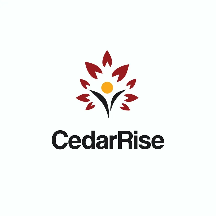
Primary logo
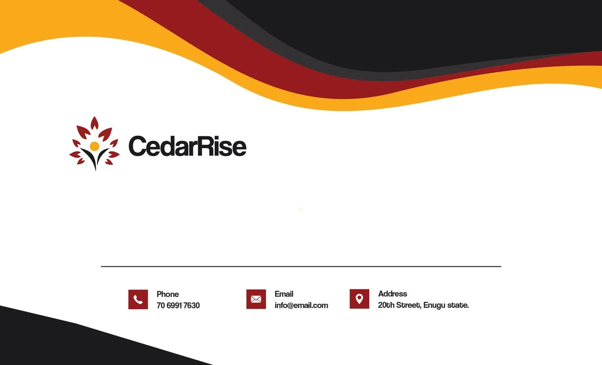
Letterhead template
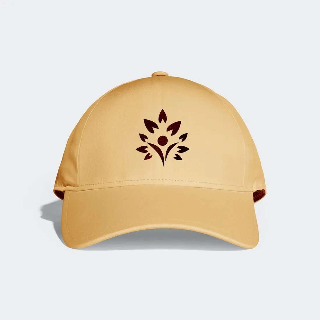
Merchandise application
Where this stands
Since launch, CedarRise reported more visual consistency across their social media accounts, and an increase in volunteer sign-ups for their programmes — feedback shared by the client, not something I measured independently.
What this project taught me
Ruling out the obvious colour forced a better answer than I might have reached otherwise — it's easy to default to green for anything about growth or nature, and having that option closed off pushed the concept toward something more specific to CedarRise, not just its category. Turning a single logo request into a full system also meant thinking past the mark itself from the start, toward everything the client would actually need to launch with.
NEXT PROJECT