Crestline Trades
Eighteen screens and flows for a multi-asset trading platform — crypto, card payments, futures, US stocks and copy trading — designed inside a two-week timeline.
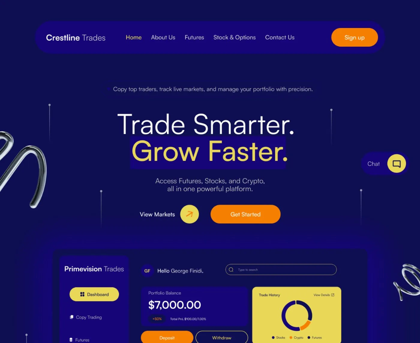
The short version
Crestline Trades needed several financial products — crypto deposits, card payments, futures, US stocks and copy trading — to live inside one account experience instead of feeling like separate tools bolted together. I contributed to requirements and user-flow development and designed the interface across 18 screens and flows, inside a two-week timeline.
Five products, one account
Crypto, card payments, futures, US stocks and copy trading each usually come with their own interface conventions — a crypto exchange doesn't look or behave like a stock brokerage. Crestline wanted all of them under one roof, as a single coherent platform rather than five bolted-together tools.
Complexity without the overwhelm
The risk with a multi-asset platform is a dashboard that tries to show everything at once and ends up showing nothing clearly. The challenge was structuring genuinely complex financial functionality into user journeys people could follow at a glance — and doing it inside two weeks.
What the design had to do
Bring crypto, card payments, futures, US stocks and copy trading into one consistent account structure.
Contribute to requirements and user-flow development directly, rather than executing a fixed spec handed down.
Move from structure to finished flows fast, without the design feeling rushed once it shipped.
What I actually did
I worked as Product Designer and UI/UX Designer, contributing to requirements and user-flow development before designing the interface itself — across 18 screens and flows covering onboarding, the core dashboard, and each of Crestline's five product areas.
How it came together
Because I was involved from the requirements stage, the first job wasn't laying out screens — it was deciding how five different products should be organised so they'd read as one platform. A competitor review of existing multi-asset platforms informed how the portfolio view should be structured, before any of the 18 screens took shape.
With two weeks on the clock, the only way to cover crypto, card payments, futures, stocks and copy trading properly was to design one reusable structure and apply it consistently, rather than treating each product as its own design problem.
Why it looks the way it does
One card pattern, five asset classes
Stocks & Options, Futures and Crypto all render through the same portfolio card shape in the dashboard. Switching between very different financial products stays visually consistent instead of feeling like switching apps.
A bolder indigo and yellow system
Where a platform like Pivot Trades leans on a calmer blue/green trust palette, Crestline uses a deeper indigo with a strong yellow and orange accent — a more assertive tone suited to a platform actively juggling five asset classes for its users at once.
The site and the product
The marketing site leads with the platform's range — futures, stocks and crypto in one place — before handing off to the product itself.
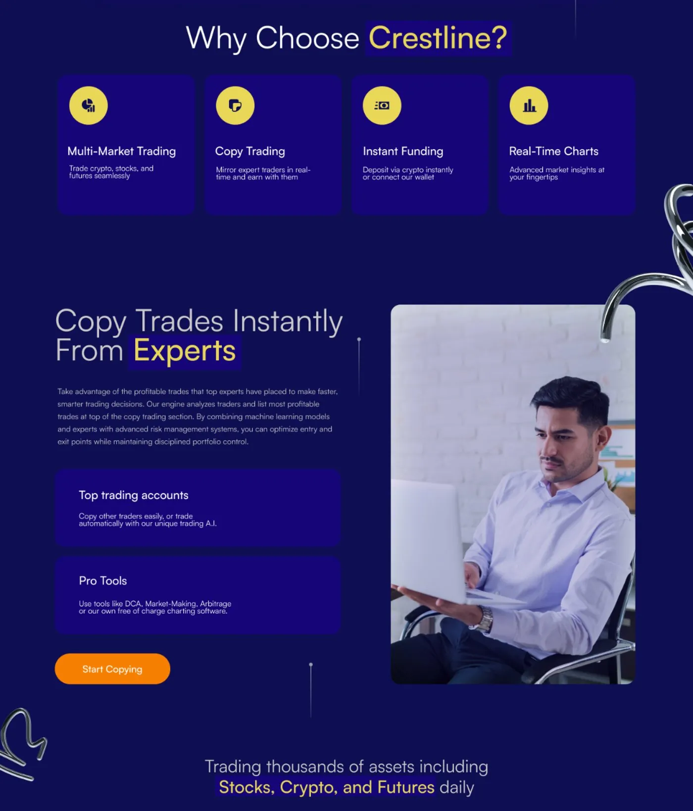
Marketing homepage — why choose Crestline
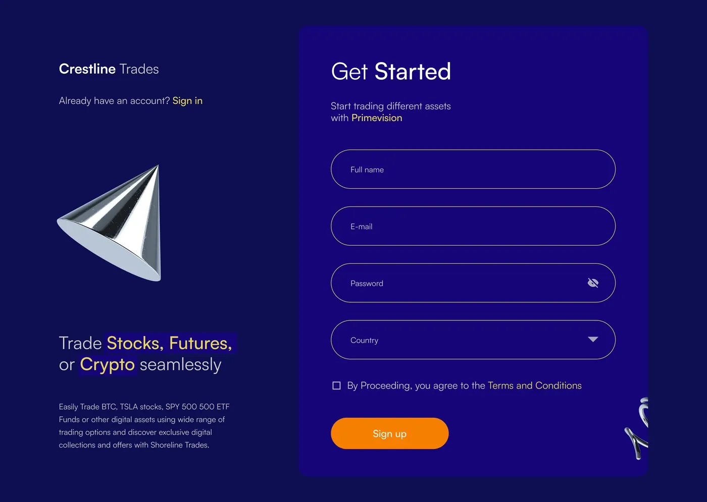
Get started — sign up
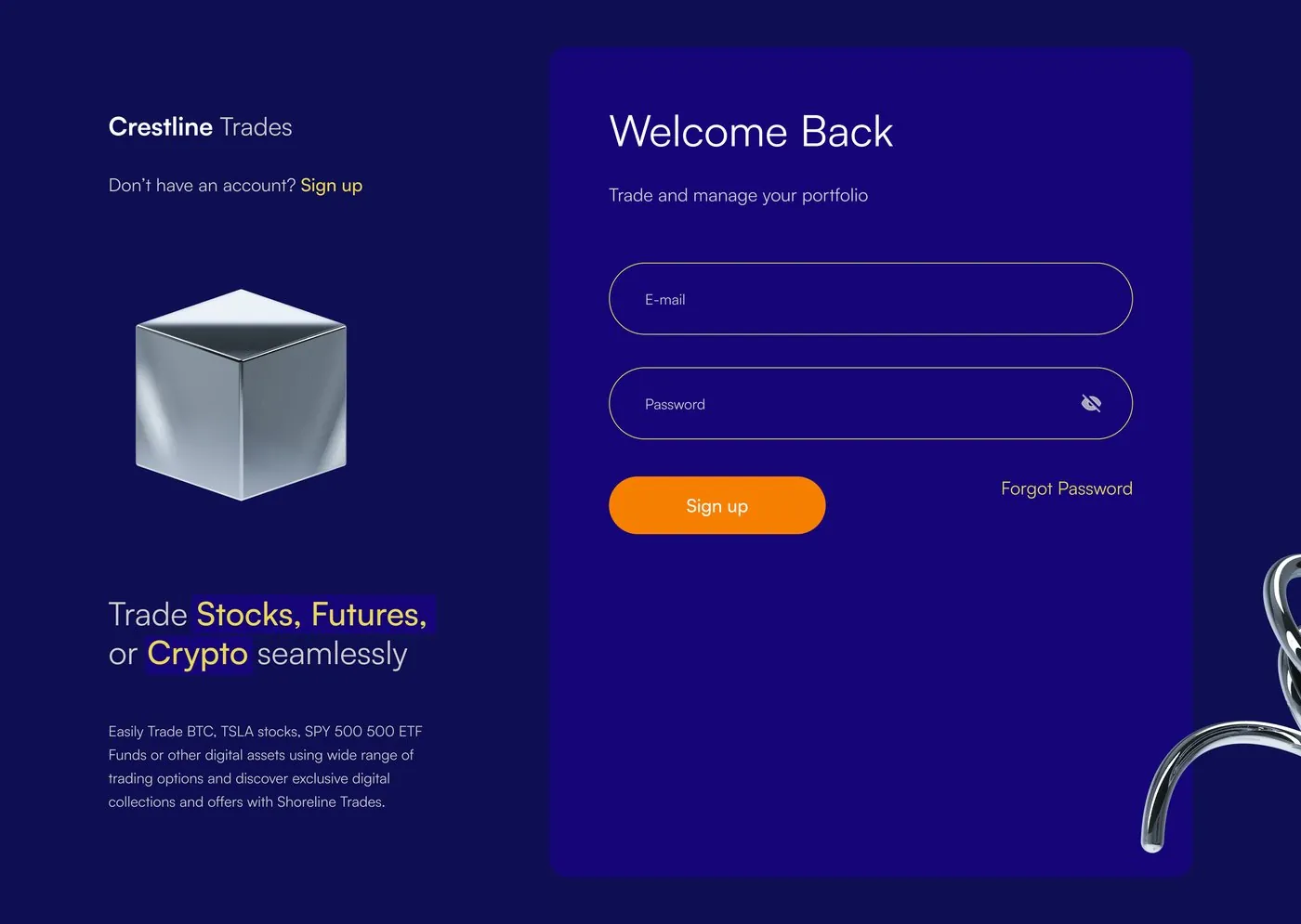
Welcome back — login
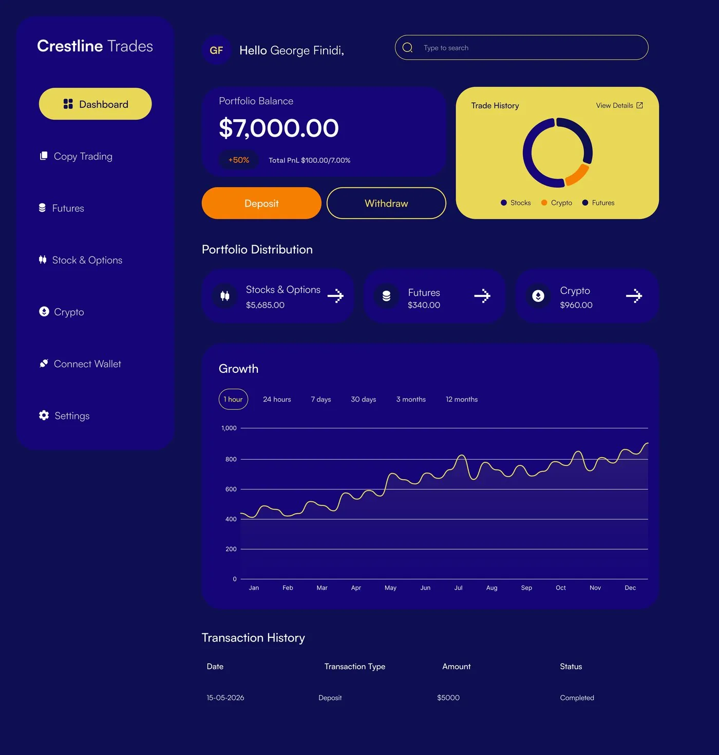
Dashboard — portfolio, trade history & growth
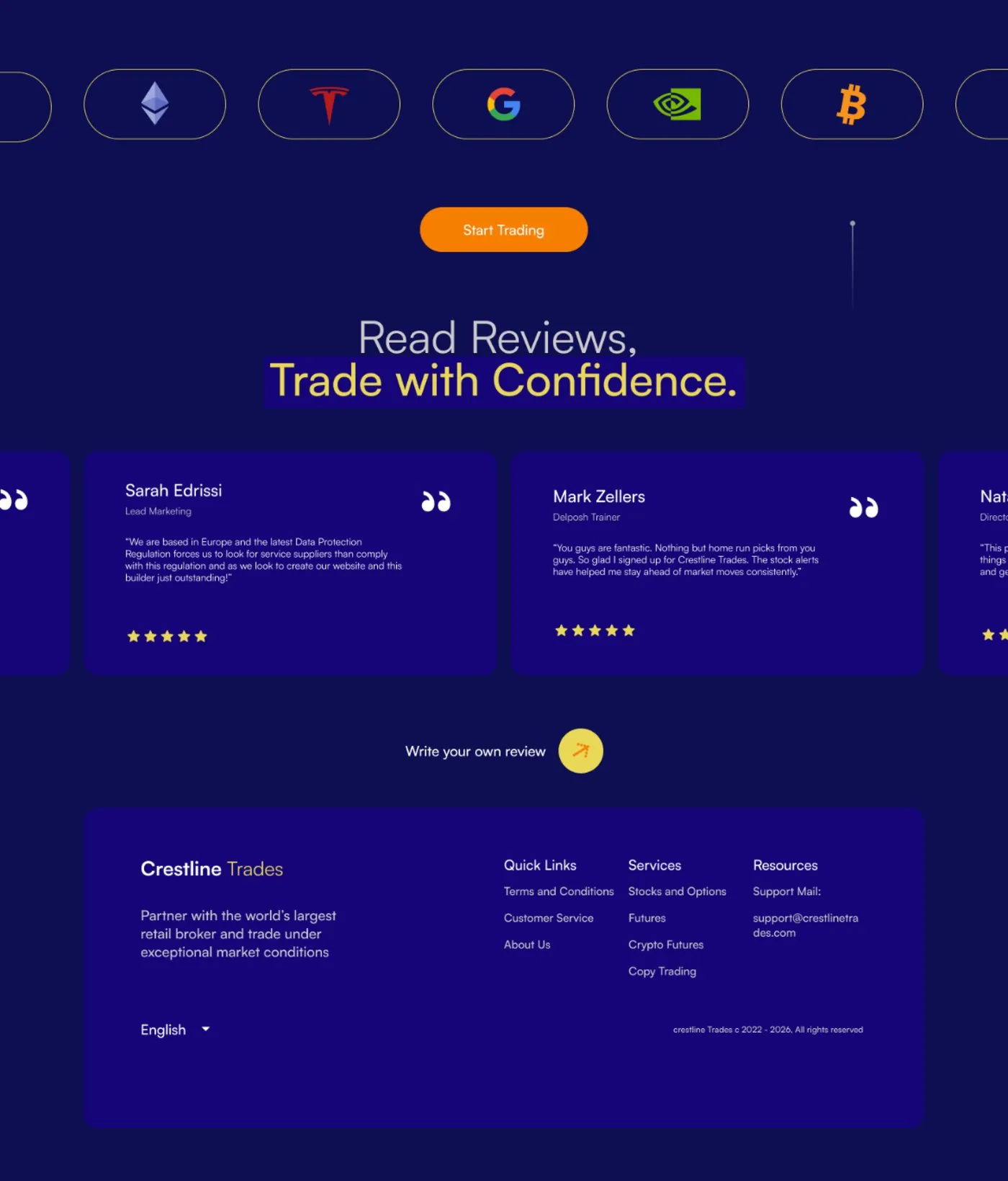
Marketing site — social proof & footer
Where this stands
The Crestline team reported a 100% increase in platform use following launch — a figure they shared with me, not one I measured independently. The 18-screen scope shipped inside the two-week timeline.
What this project taught me
Being involved from the requirements stage — not just receiving a spec — changed how I approached the whole platform: the priority was deciding how five products should relate to each other before designing any single screen. Two weeks is a tight window for that much financial complexity, and the only way it worked was committing early to one reusable structure instead of designing each product area from scratch.
NEXT PROJECT