Jeko Design Studio
The identity for my own studio: founded and branded in 2024, paused in 2025, and back in operation in 2026, with the website now in design. Every piece on this page is my own work.
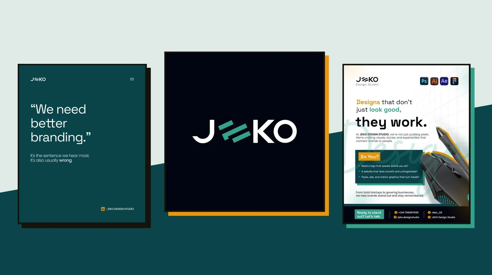
The short version
I founded Jeko Design Studio in 2024 and branded it the same year, as its Creative Director. The studio covers branding and strategy, UI/UX and software development. Operations stalled in 2025 because there weren't enough hands to run it, and picked back up in 2026. I'm currently designing the studio's website.
The studio is the first client
A design studio's own brand is the first piece of work anyone judges it by. Before a prospective client sees a portfolio, they see the profile picture, the header and the posts, so the identity had to be as considered as anything the studio would sell.
Three services, one studio
Branding, product design and software development usually come from different kinds of companies with different visual habits. Jeko needed one identity that could credibly hold all three, and a voice that sold what good design does for a business, not just how it looks.
What the design had to do
Work as a tiny profile picture, a wide social header and a symbol on merchandise.
Give the studio a point of view it could state plainly in its posts and adverts.
Ship with enough templates and launch pieces to start posting straight away.
What I actually did
As Founder and Creative Director, I designed the whole identity and everything built from it: the wordmark and symbol, the colour system, the social profile and header, launch adverts, the team introduction format, educational carousel content and merchandise. The website is the next piece, and it's in progress now.
How it came together
The wordmark starts from the name itself. The "E" in JEKO is replaced by three slanted bars, the middle one hooked at its end, set between a clean J, K and O. Read in the word, the bars are unmistakably an E; pulled out on their own, they become the studio's symbol, which is how they appear on the cap.
The palette is built around a deep petrol teal, with a lighter jade green for the symbol and highlights, near-black for contrast, and amber reserved for the things you should act on. From there I built the pieces a new studio needs to show up online: a profile picture, a header stating the tagline and the three services, a team introduction card, a numbered carousel format for opinion-led content, and two adverts, one for the studio as a whole and one for its flyer design service.
Why it looks the way it does
An E that stands on its own
Building the E from three angled bars gave the studio a symbol for free. It reads as a letter inside the wordmark and as a standalone mark anywhere the full name won't fit.
Teal as the base colour
A deep petrol teal carries most of the brand, from the header to the carousel slides, giving the studio a colour of its own that sits comfortably behind branding, product and software work alike.
Amber means "act here"
Amber is used sparingly, on the calls to action, social icons and key words, so that across every post it points to the same thing: the next step.
A voice with an opinion
Lines like "Designs that don't just look good, they work" and a carousel that opens by calling "We need better branding" usually wrong give the studio something to say, not just something to show.
The identity in use
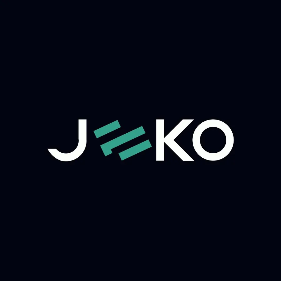
Wordmark, used as the profile picture
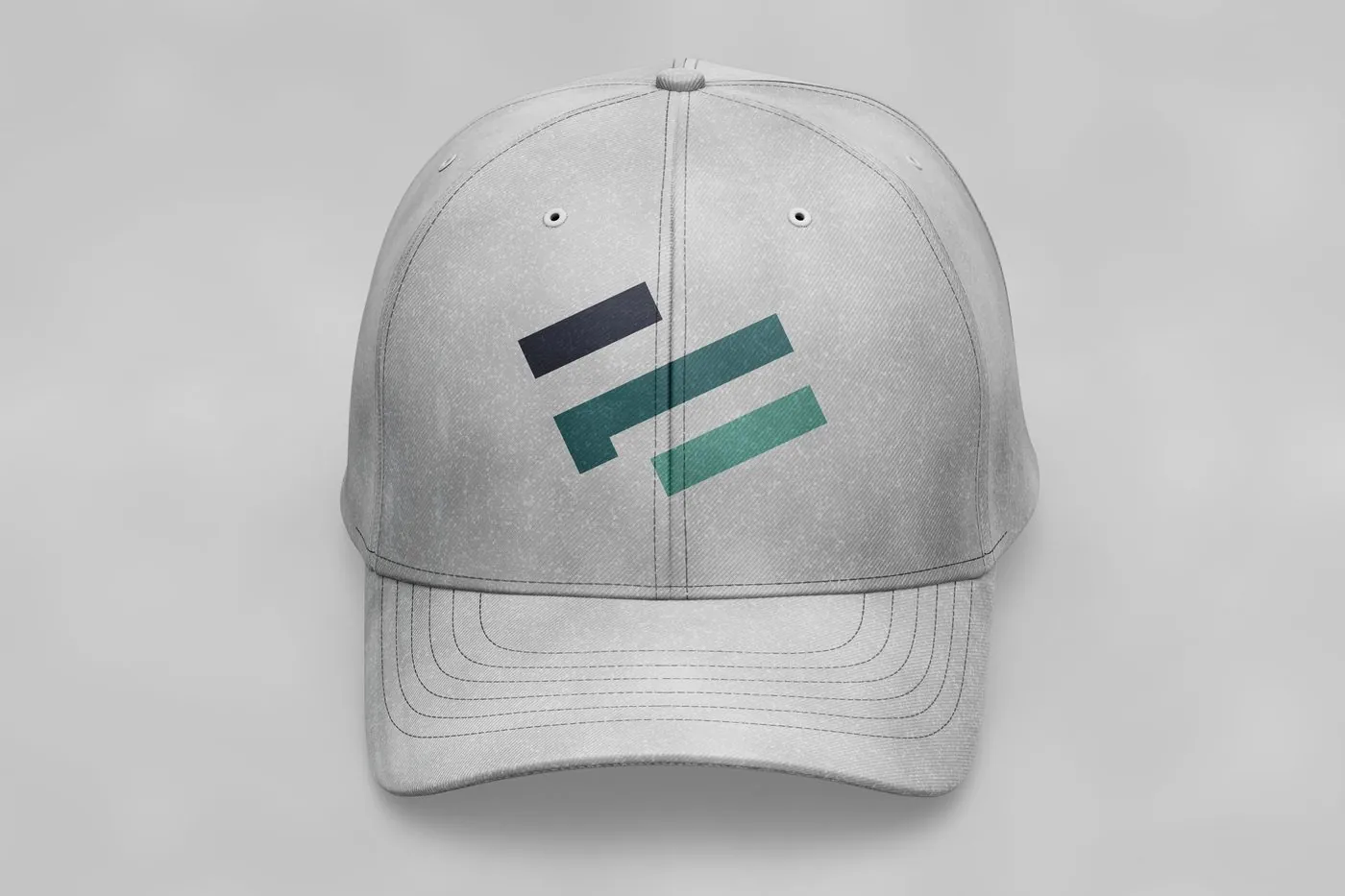
The three-bar symbol on merchandise
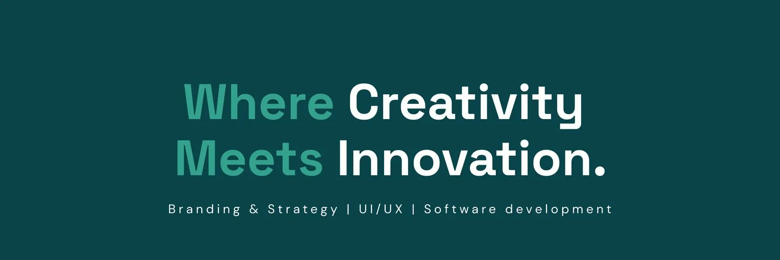
Social header: tagline and services
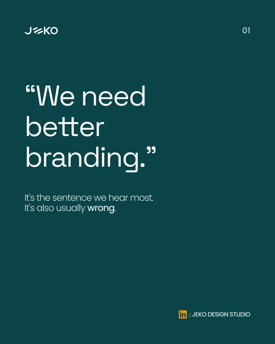
Carousel content, slide 01
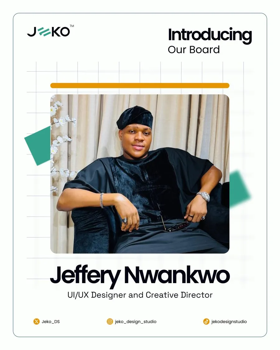
Team introduction card
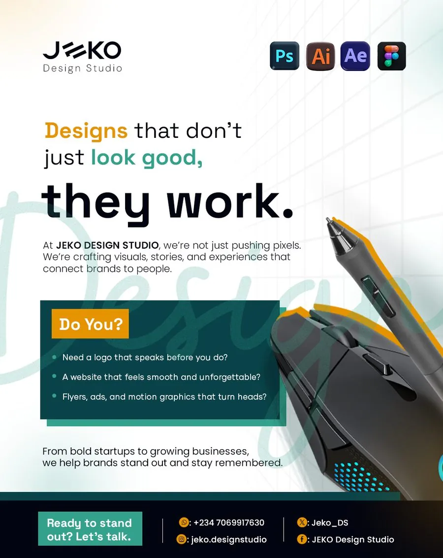
Studio advert
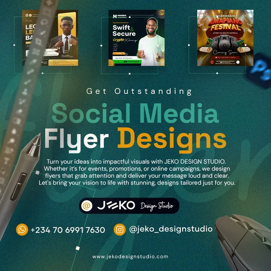
Service advert: social media flyer design
Where this stands
The studio launched in 2024 with a complete identity and a set of social pieces ready to post. In 2025 operations stalled for lack of manpower; in 2026 the studio is running again on the same identity, unchanged. The website is the next piece, and I'm designing it now.
What this project taught me
Being your own client is harder than it sounds: there's no brief to push against, so every decision has to be one you'd defend to someone else. The pause in 2025 was also a lesson that a studio runs on people as much as on its brand. The upside was that coming back in 2026 didn't mean starting over. The identity was complete enough to pick straight back up.
NEXT PROJECT