Pivot Trades
A 24-page trading platform for crypto, forex and indices — designed from a completely blank brand slate, in one month, alongside the client's development team.
The short version
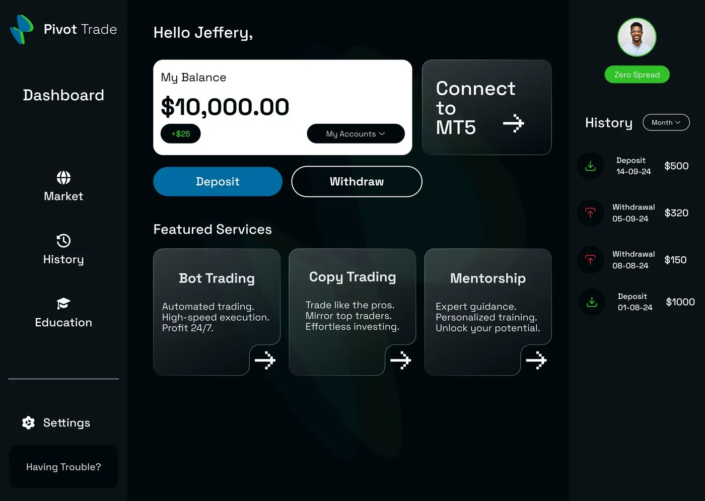
Pivot Trades' founder wanted a single platform where traders could move between crypto, forex, indices and commodities without the experience feeling stitched together — and without a brand identity to build on yet. I joined a small existing team that included developers, and owned the brand direction and interface design end to end: colour system, every one of the 24 pages, and the in-app dashboard.
Starting from zero
The owner brought me onto the project alongside a small development team already in motion. There was a clear product vision — a seamless crypto and indices trading platform — but nothing to visually build on: no logo, no colour palette, no type system, just a name and a direction.
Trust has to show up first
Trading platforms live or die on trust. A dashboard that feels generic or cluttered makes people hesitate before they connect a wallet or deposit real money — and with multiple asset classes to track at once, it's easy for that dashboard to turn into noise instead of clarity.
What the design had to do
Establish a visual identity — colour, tone, type — with no existing guidelines to reference.
Design a full 24-page responsive site and dashboard inside a one-month timeline, in step with the dev team building it.
Surface live-feeling data across several asset classes without overwhelming a first-time visitor.
What I actually did
I was brought on as UI/UX Designer and Website Designer, joining a team that already included developers. My side of the project was design-only — I owned brand direction and interface design across every one of the 24 pages, while the build itself sat with the rest of the team.
How it came together
With no brand to inherit, the first job was direction — landing on a colour system before touching layout. From there I prioritised the screens a new trader hits first: sign up and account settings, since those set the tone for trust before anyone sees a chart. The dashboard and market overview followed, built around the same card system so a five-asset watchlist and a transaction history could sit on the same screen without competing for attention.
Because I was working inside a team that included developers, every layout decision had to stay realistic for a one-month build — this wasn't a research-heavy engagement with user interviews or usability testing; it was close, iterative work with the founder, refining screens against his feedback as the site came together.
Why it looks the way it does
A blue and green system
With no existing brand, colour was the first real decision. Blue reads as stable and trustworthy — important when you're asking someone to connect a wallet. Green signals growth, and doubles as the "positive" colour in market data, so the brand palette and the product's own charts could share one language instead of competing.
A dark interface base
A near-black UI reduces eye strain for a product people check repeatedly through the day, and matches the visual language traders already expect from charting tools — so the platform felt familiar rather than unfamiliar on day one.
The site and the product
The marketing site introduces Pivot in plain terms — what it does, why to trust it — before the product takes over.
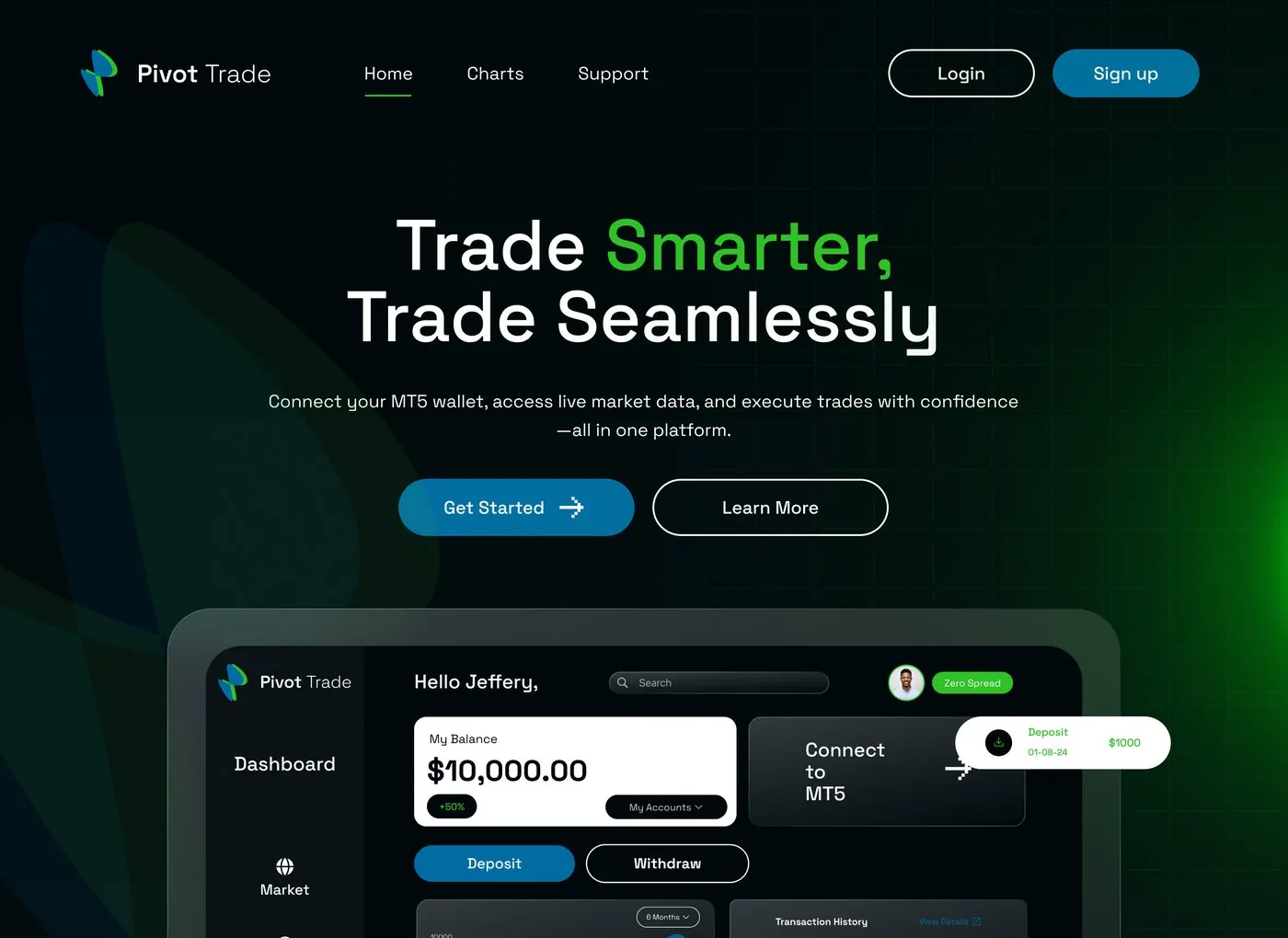
Marketing homepage — hero
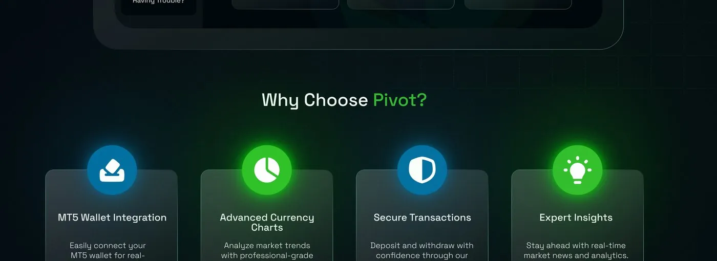
Marketing homepage — feature breakdown
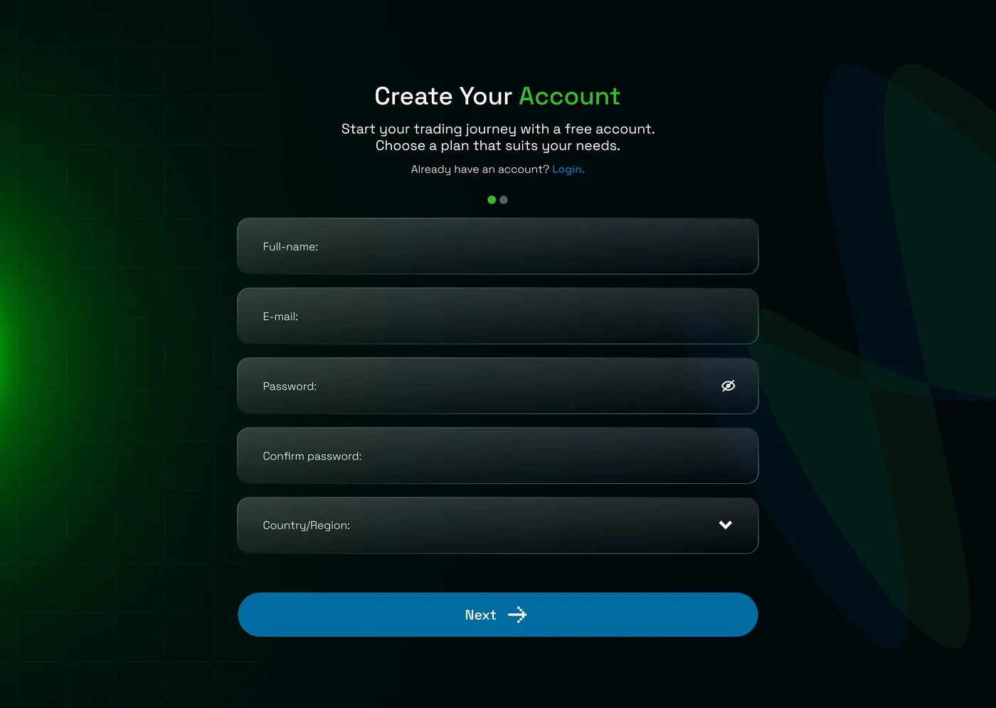
Create account
Dashboard
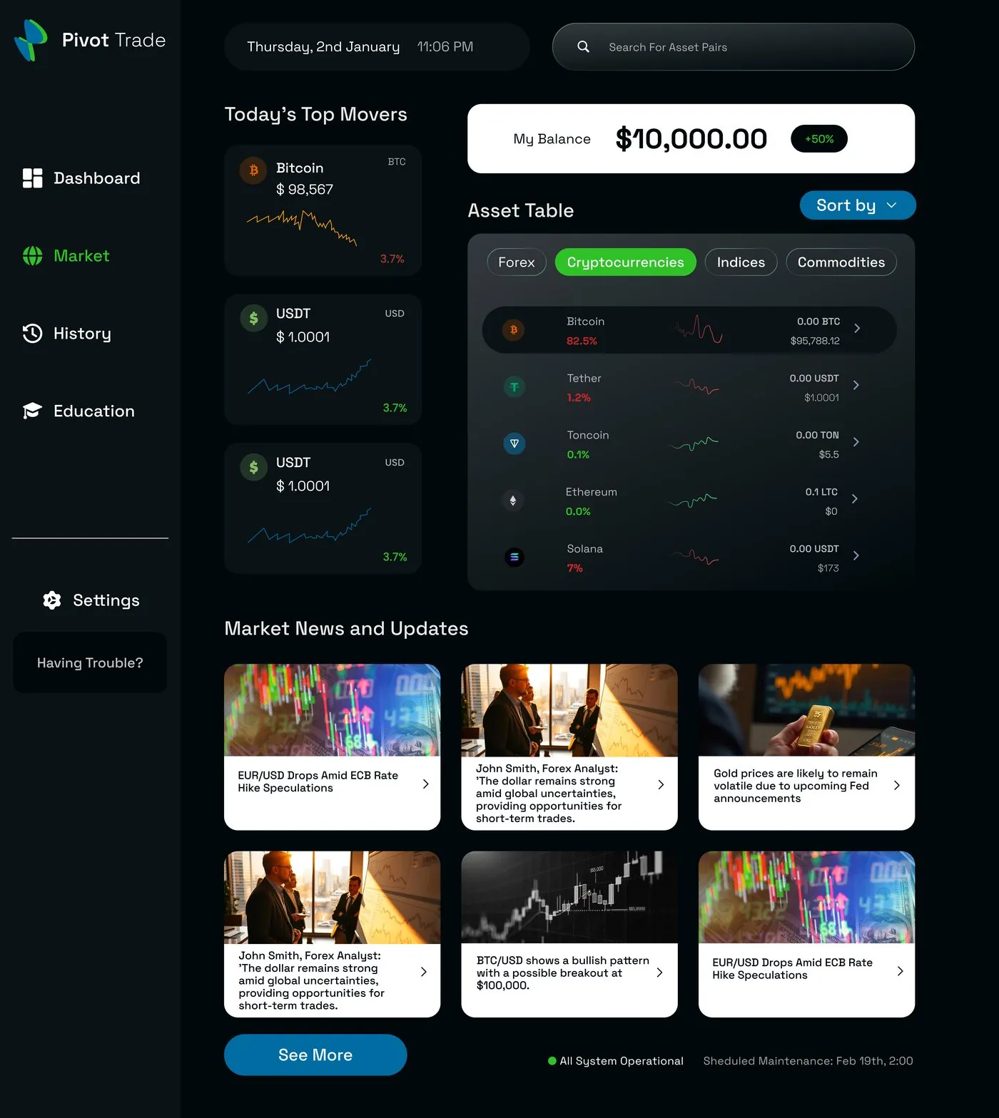
Market overview — multi-asset table
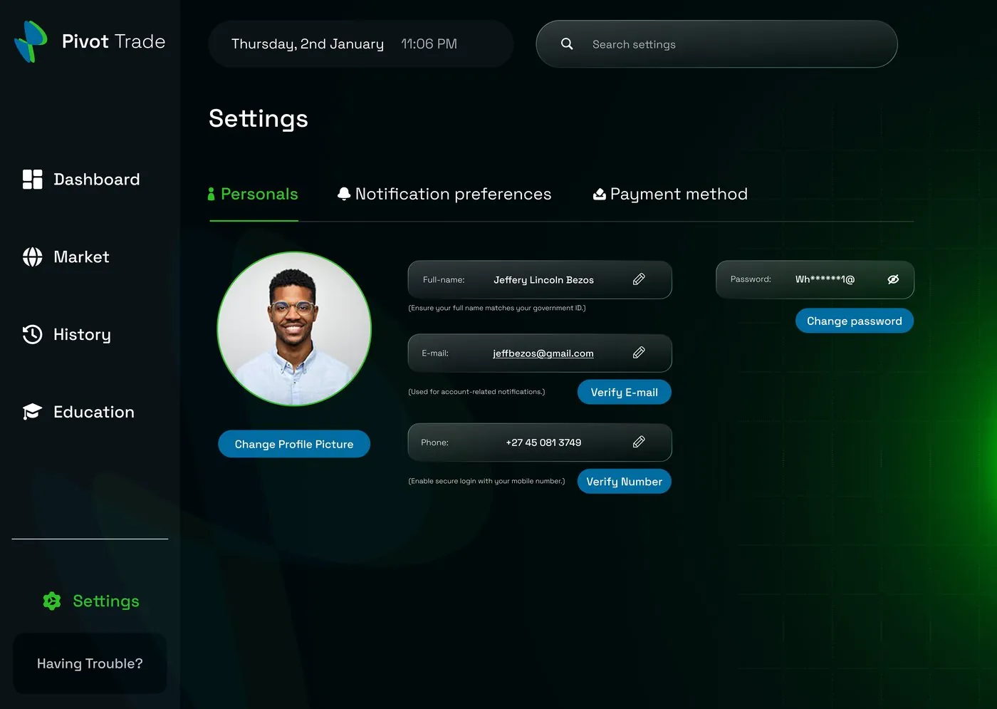
Account settings
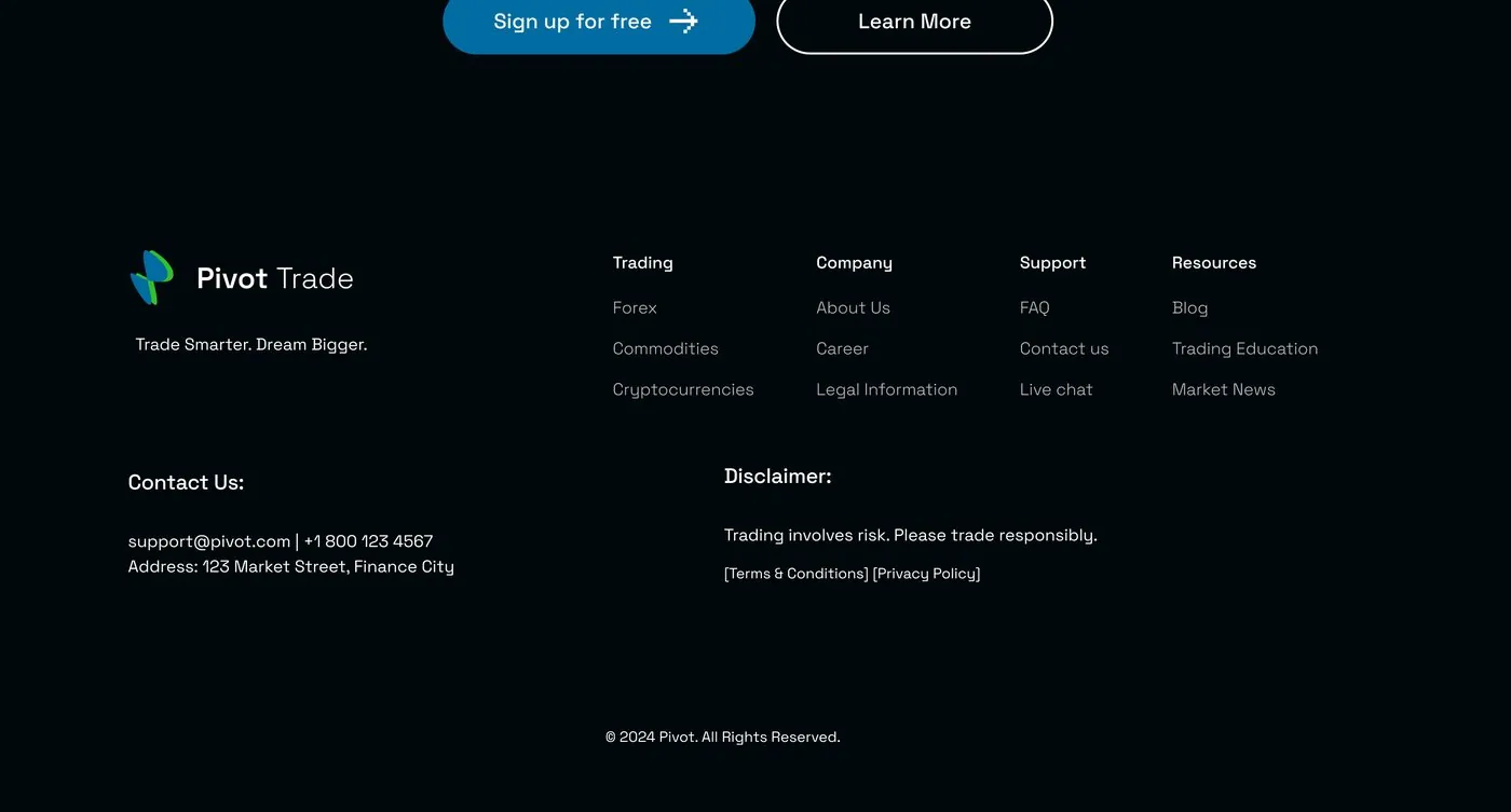
Marketing site — footer
Where this stands
The engagement was scoped around two things: making the platform trustworthy enough to convert a first-time visitor into a signed-up trader, and making the day-to-day dashboard usable once they're inside. The site shipped as a 24-page build within the one-month timeline. Pivot Trades is under NDA, so no live link is included here.
What this project taught me
Designing inside an existing team changes how you work — every screen had to be something realistic to ship in a month, not just something that looked good in a file. And building a brand and a product interface at the same time, with nothing to inherit, meant every colour and spacing choice had to earn its place rather than follow a guideline that already existed.
NEXT PROJECT