JEKO Pay
A self-initiated Web3 payment concept, designed to feel as simple as Apple Pay — without losing the transparency that makes blockchain worth using in the first place.
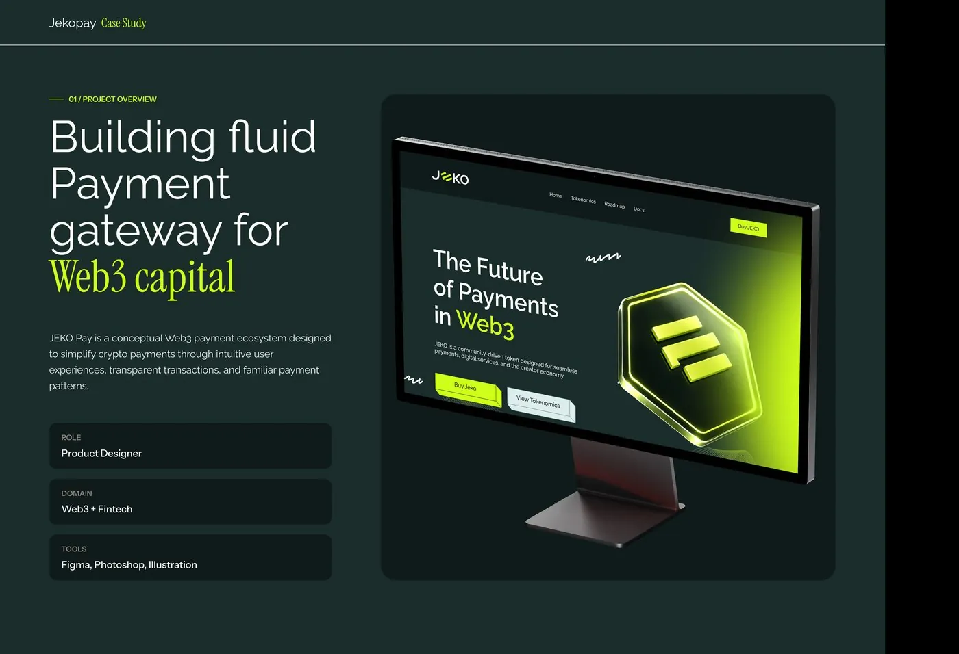
The short version
JEKO Pay is a self-initiated concept for a Web3 payment ecosystem — a token-based way to pay for digital services, support creators and move value peer-to-peer. I designed it end to end as a passion project: the product narrative, the landing experience, the tokenomics, and the trust messaging needed to make a crypto product feel approachable to someone who's never touched a wallet before.
A self-directed exploration
No client, no brief — JEKO Pay came from wanting to design a genuine answer to a problem I kept noticing across real Web3 products: the payment experience itself is usually the weakest part, even when the underlying technology works fine.
Crypto payments are intimidating
Five specific frictions kept showing up: long wallet addresses people fear mistyping, hidden gas fees that erode confidence, anxiety over payments that can't be reversed, onboarding with too many technical steps before a first payment, and a general low trust in unfamiliar Web3 products.
What the design had to do
Match the ease of a mainstream payment app without hiding what makes it a blockchain product.
Surface smart-contract verification, security and tokenomics as clear signals, not fine print.
Carry a single narrative from landing page through tokenomics, onboarding and roadmap.
What I actually did
I worked as Product Designer across the entire concept — there was no team and no client, so every decision from product narrative to visual system sat with me.
How it came together
I started from the problem, not the visuals — naming the specific frictions (wallet addresses, gas fees, payment anxiety, onboarding, trust) before designing a single screen, so the rest of the product had something concrete to answer. From there the narrative built outward: what JEKO is, how to actually buy it in four plain steps, what you can do with it once you have it, why it can be trusted, and where it's headed.
Because this was self-directed, there was no client feedback loop or user testing to validate against — every call was mine to make, based on patterns I'd observed across real Web3 products rather than on research conducted for this project specifically.
Why it looks the way it does
One acid-green accent on near-black
A single saturated accent against a dark base reads as a current, technically credible Web3 product rather than a generic marketing site — and keeps every trust signal and CTA visually consistent.
Trust made visible, not buried
"Smart Contract Verified," "Secure Transactions" and "Transparent Tokenomics" are treated as their own visible badges rather than footnotes — a direct answer to "Low Trust" as a named problem, not an afterthought.
The full narrative
From naming the problem to a roadmap for what comes next — one continuous story.
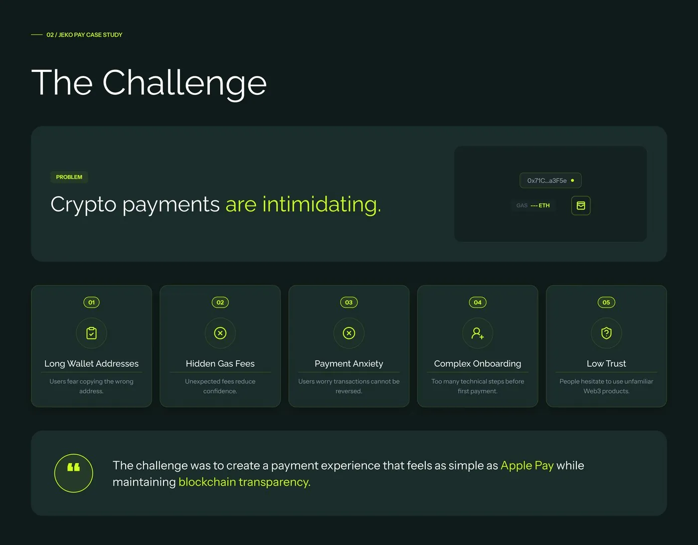
The challenge — naming the friction first
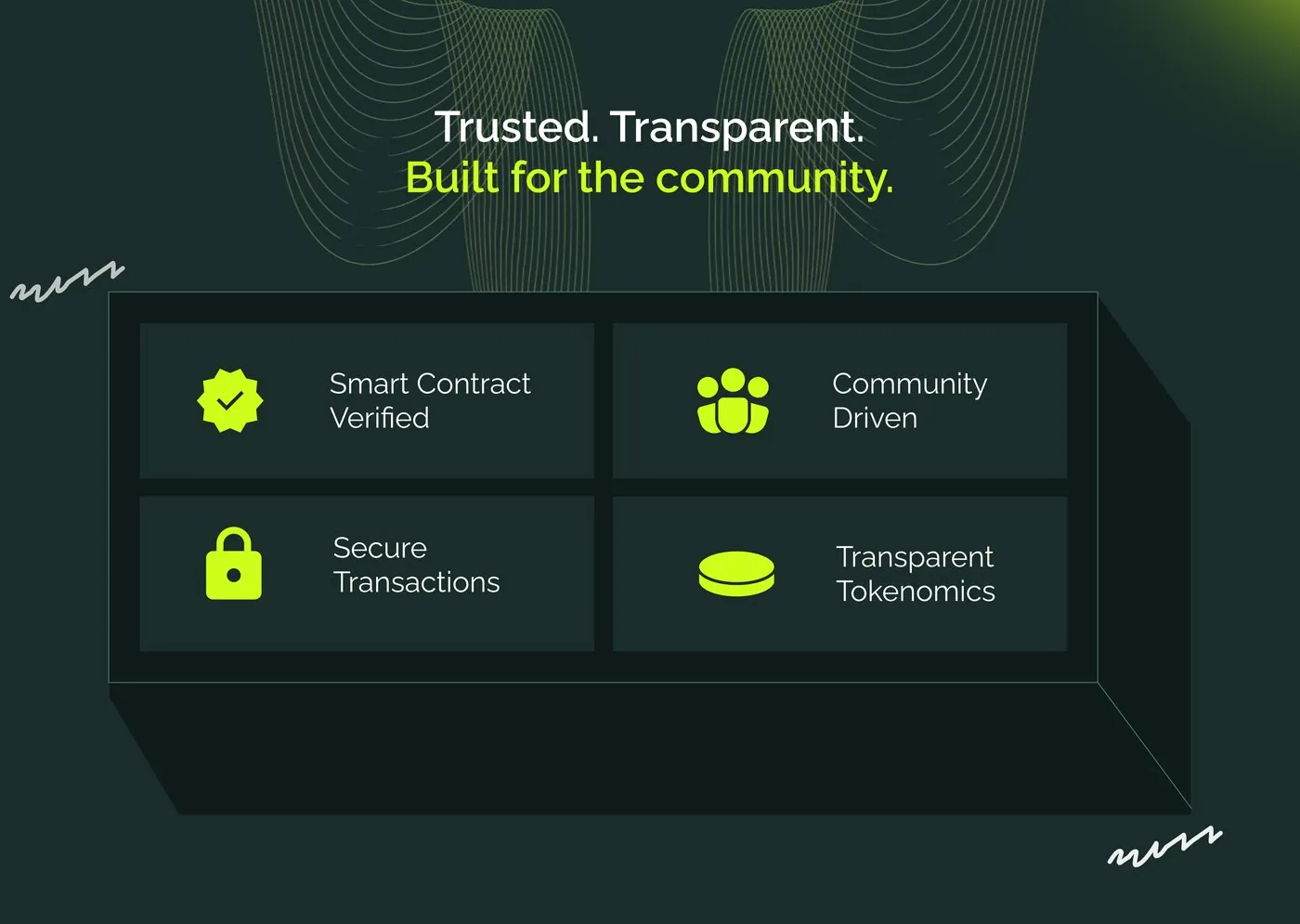
Trust, made visible
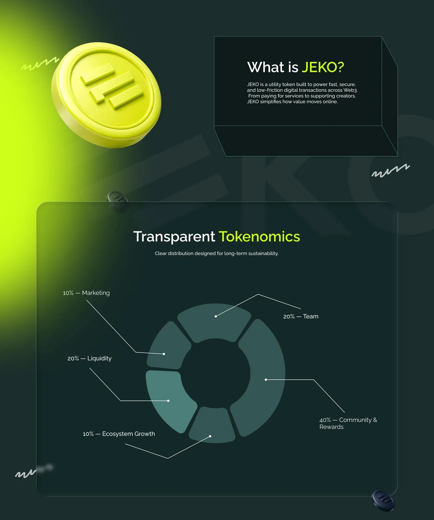
What JEKO is, and where the token goes
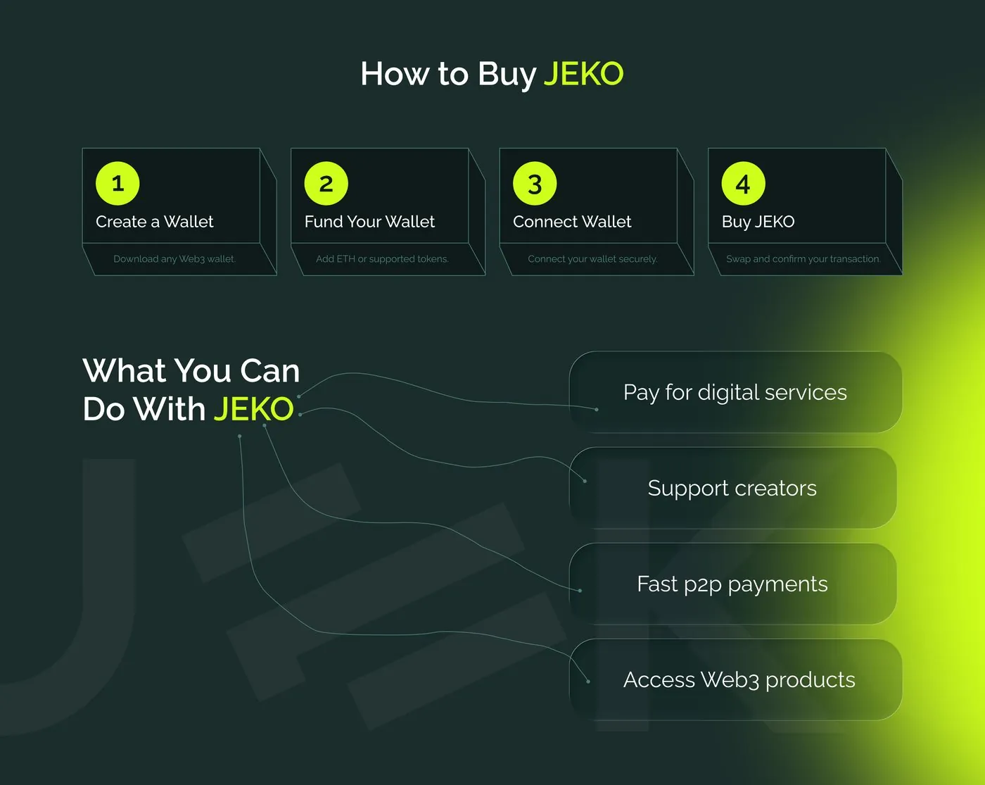
Onboarding in four plain steps
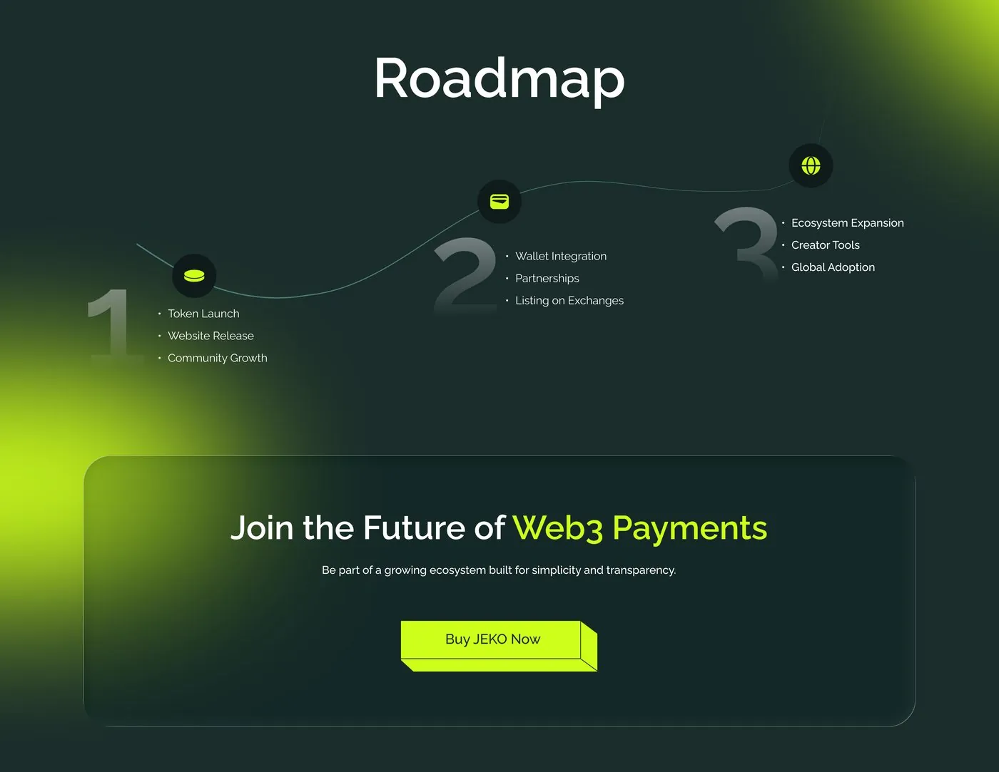
Roadmap
Where this stands
As a self-directed concept, JEKO Pay has no client outcomes or usage metrics to report — its value was in designing a complete, coherent answer to a real Web3 UX problem, end to end, on my own terms. The full presentation is available on Behance.
What this project taught me
Working without a client meant full control over the narrative, but also no one to push back or validate a decision against — every call, from the colour system to what counted as the "real" problem, had to be justified by my own reasoning rather than a stakeholder conversation. Starting from the friction points rather than the visuals kept the project honest: it's easy to design a good-looking crypto landing page, harder to design one that actually addresses why people hesitate in the first place.