Xspot Exchange
Twelve months as social media designer for a cryptocurrency and FX exchange — roughly 120 campaign assets, holding one visual identity together across trading, gift cards, FX and payment services.

The short version
For twelve months I worked as Xspot Exchange's social media designer, producing around ten campaign posts a month — roughly 120 pieces in total — across crypto trading, FX transactions, gift cards, RMB payments, Alipay, WeChat and bank-payment services.
One page, several services
Xspot isn't a single-product brand — crypto trading, foreign exchange, gift card redemption and international payment rails all needed regular social content, often in the same week. That's a wide spread of services to keep visually connected.
Volume without drift
Posting roughly ten times a month for a year is enough content that visual identity can quietly drift — different treatments creeping in service by service, campaign by campaign — until the page stops reading as one brand.
What the work had to do
Keep ~120 posts across a year visually consistent, regardless of which service each one promoted.
Give crypto, FX, gift cards and payment rails their own campaign moments — not just the flashiest product.
Stay credible as a financial brand while still producing content that stops the scroll.
What I actually did
I worked as Social Media Designer on a twelve-month engagement, delivering roughly ten campaign assets a month — around 120 in total — spanning product promotions, seasonal and holiday content, and always-on service messaging.
How it came together
A twelve-month retainer is less about one big exploration and more about building a system that holds up post after post. I worked with a repeatable template language — consistent logo placement, a recurring contact-info bar, and a blue/black/yellow colour rotation — so each new post could be produced quickly without starting from zero, while still looking like it belonged to the same brand as the one before it.
The calendar mixed two kinds of content: always-on product posts (gift card redemption, Pi coin payouts, instant swaps) and seasonal moments (Easter, a new month, Valentine's Day) that needed the same system to flex without breaking it.
Why it looks the way it does
A reusable template system
The XS.pot mark sits in the same spot, the contact bar reads the same way, and a small blue / black / yellow rotation carries every post — so at ten posts a month, each one is still instantly recognisable as Xspot.
Two deliberate tones, one brand
Some posts lean playful — reaction-image energy built to get shared — while product and security-led posts stay polished and trust-forward. That range is intentional: a financial brand still needs to be scroll-stopping sometimes.
A sample from the year
Ten posts from across the engagement, shown at their original size and proportions.
Brand / product — Fast & Secure Exchange

Product — Seamless Trading

Product — Instant Payout

Product — One Stop, All Swaps

Service — Gift Card Redemption

Service — Pi Coin Payouts

Engagement — Shocking Crypto Deals
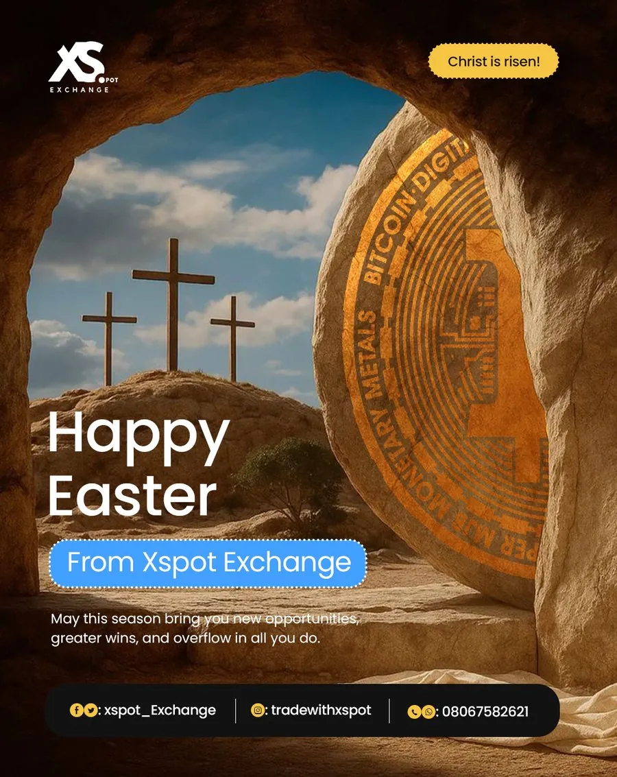
Seasonal — Easter

Seasonal — Valentine's Day

Seasonal — New Month, December
Where this stands
Over the engagement, maintaining visual and messaging consistency across every service category contributed to a 48% increase in customer reach, a 10% increase in social media engagement, and over ₦20 million in additional monthly transaction volume — figures reported by the Xspot team, not independently measured by me.
What this project taught me
A twelve-month retainer is a different discipline from a single project — the win isn't one great post, it's a system that still looks coherent on post 118. Designing across that many service lines also meant resisting the pull to only make content for the flashiest product; gift cards and payment rails needed the same care as crypto trading, even when they were less exciting to design for.
NEXT PROJECT